Gallerio - Responsive Web Design Case Study
Project Duration: January 2025 - February 2025
Role: UX/UI Designer
Responsibilities: Research, Wireframing, Prototyping, UI Design, Accessibility
Art galleries and museums are timelessly popular institutions. They act as beacons for art and culture that attract locals and visitors from across the globe.
The problem:
Research into these establishments highlighted a lack of access to information regarding upcoming events and exhibitions, coupled with an inability to book in advance. As a result, these lovers of art and culture often missed out on attending events and exhibitions of interest. Leaving them unable to make time for themselves and the things they enjoy.
The Goal:
Here, the end result was to create an environment for users to to view and access upcoming events and exhibitions, create a personalised favourite list, and book such events in advance. The ultimate goal being to provide users with a platform to keep track of events and dates of interest and avoid missing out like they have done before.
Empathise

Getting to know the users
By analyzing user bios, I gained a deep understanding and empathy for each individual’s needs, identifying common issues across cases. This allowed me to group users into distinct categories and better understand their daily struggles and routines, providing a strong foundation for problem-solving moving forward.
1
Users don’t know what exhibitions are open and available until it’s too late - by then, they are either sold out or the exhibition has ended. Wants to know what’s coming up.
User Research - Pain Points
2
Limited budget means it’s hard to always do the things user wants to do and the user worries when they spend too much money on the things they enjoy
User Persona’s
Damian - Problem Statement
A busy doctor and mother of two who needs to find a convenient way to find information on upcoming events and art exhibitions and book these in advance because she often finds it confusing having to search multiple websites and as a result misses out on events because they have either passed or are already sold out.

3
User needs an easy to read and navigate site due to visual needs and/or lack of time to waste trying to navigate apps
4
Responsibilities at work make it hard to find time to do the things they enjoy - embracing art and culture

Damian - Problem Statement
A lover of art and culture who struggles with finding people similar to himself within his day to day life, he needs a convenient way of finding events and people that share similar interests and hobbies because this will help to combat his loneliness and give him a means of unwinding and socialising after a busy day at work.
User Journey Map
In order to design with user goals and motivations in mind, I moved onto mapping the user journey.
Placing additional value on the emotional impact associated with each step, I ensured a human-centric focus at all times.


Define
I conducted a competitive audit to understand the current user experience of similar products and services, focussing primarily on the booking process and the presentation of upcoming events and exhibits.
I gained valuable insights into their web design and navigation flows, helping me to identify elements and features that users would inform the development of my own designs.
Problem Statement
Art and culture enthusiasts struggle to find relevant experiences and keep track of upcoming opportunities. They often find it difficult to connect with like-minded individuals or navigate multiple sources for event information, leading to missed opportunities and frustration.
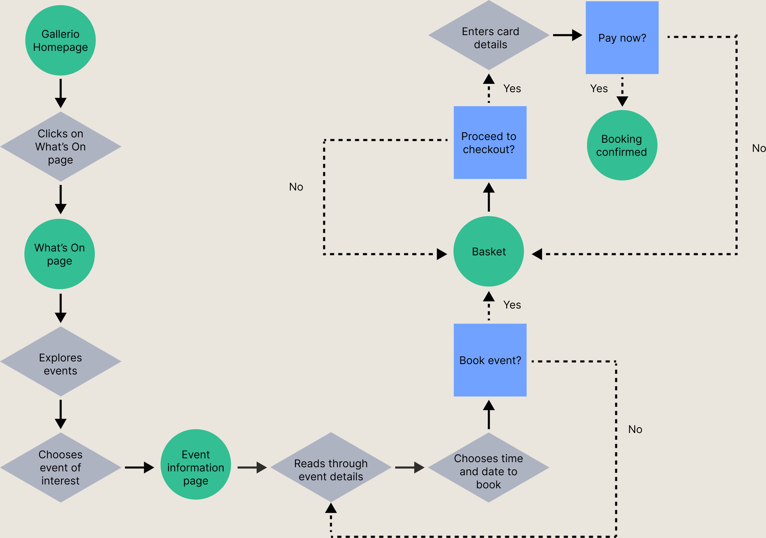
User Flow
Alongside exploring the art on dislay and their associated artists, a significant focal point for Gallerio was to provide easy access to viewing and booking onto upcoming events and exhibitions of interest.
This user flow depicts such an interaction - ensuring the user is only a handful of clicks away from being able to view and book their desired event.
Ideate

From defining my user to generating solutions.
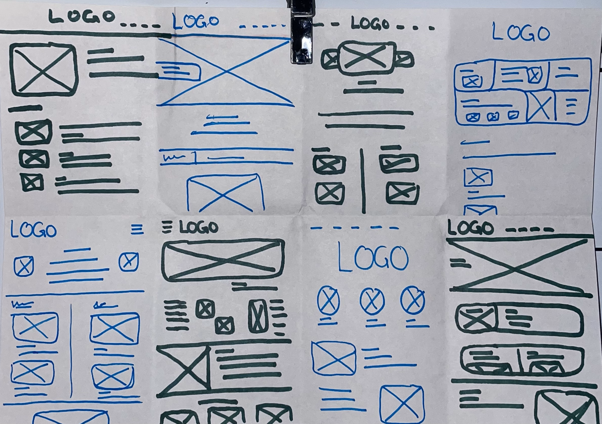
To ideate effectively I engaged in a session of crazy 8’s. With the hopes of generating some interesting website design layouts, I set my timer and allowed my imagination to run wild.
Gallerio Sitemap
I then combined my understanding of the typical user journey, with my competitive anlysis and was able to generate a sitemap for Gallerio’s website.
The sitemap is aimed with the users desires and needs in mind; ensuring a simplistic and intuitive flow throughout the product in which the structure and organisation of the pages were decided carefully.
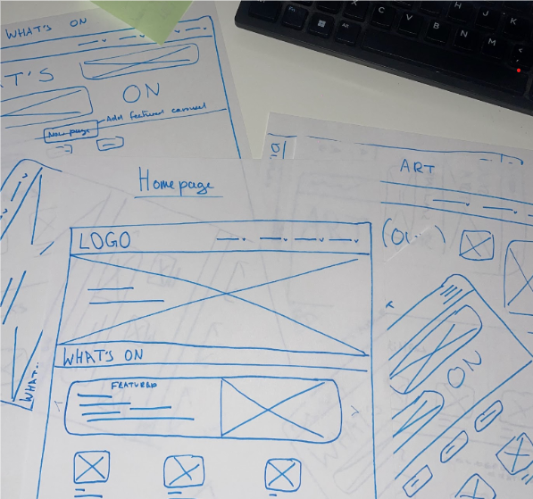
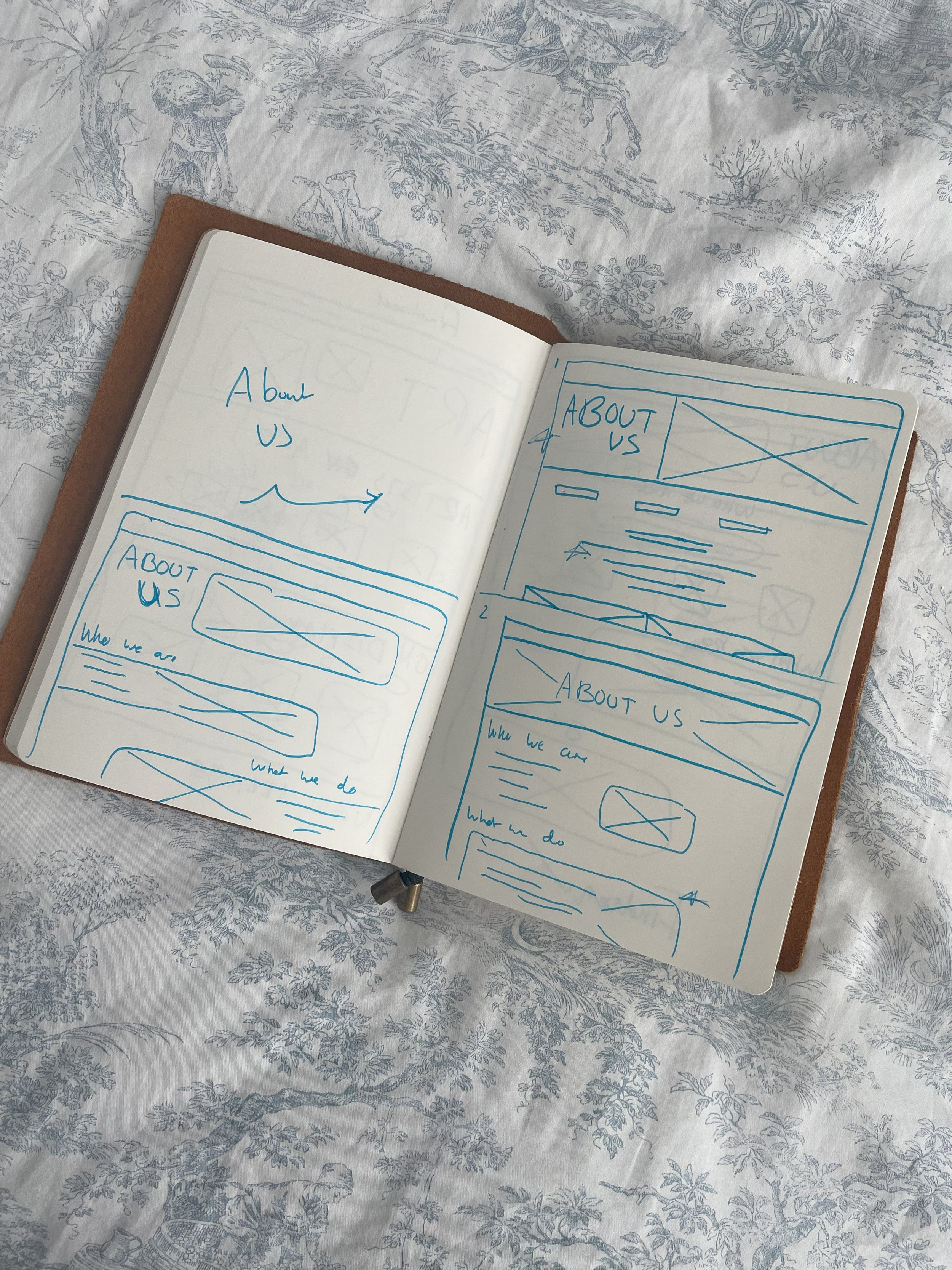


Paper Wireframes
A process of rapid ideation left me with a number of potential ideas which I then narrowed down into the best and most suitable, considering both design and user appeal.
This brings me on to Digital wireframes
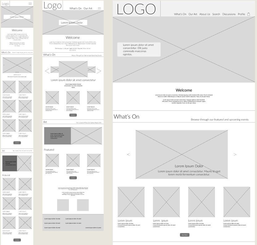
I could then begin to convert my paper wireframes for my website. Alongside focussing on the web page layout, I also had to consider how and where the content would be displayed on mobile and tablet devices, given that the aim here was to create a responsive webpage.
My decision making process considered the following…


Hero page designed to create a calm, airy feeling with a simplistic, minimalist approach, inspired by the atmosphere of an art gallery.
Subsequent pages use simplicity, negative space, and concise descriptions to avoid overcrowding while ensuring key information is present.
Website is responsive, with wireframes created for different screen sizes to ensure optimal display across devices.
Navigation adapts to smaller screens with a hamburger menu, ensuring efficient use of space on mobile and tablet devices.


Quick changes
Before starting my Hi-Fi mock-ups, I decided to revise the site's layout. The original design felt overwhelming, with large text and crowded elements that didn’t align with the modern, minimalist approach I envisioned.
I made adjustments to the text styles and reimagined the layout with more negative space and smaller elements, aiming to create a light, delicate feel similar to a physical gallery.
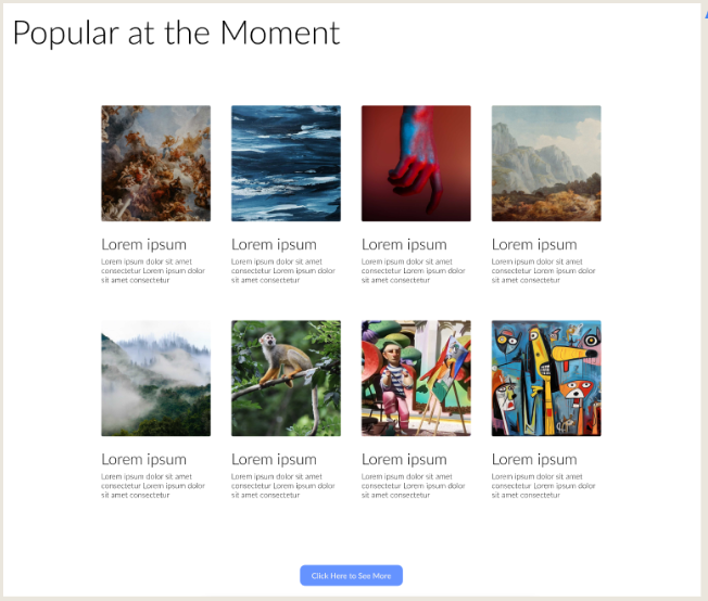
Hi-Fi Mockups
Moving onwards, I began adding a splash of colour to these wireframes and some additional elements, bringing them to life.
I carefully chose my visual design elements to portray a clean and welcoming aesthetic. My goal was to capture the atmosphere and feeling that one gets within a physical art gallery and replicate it within my virtual design.


Test

Here are my findings and iterations…
User journeys were slowed down by lack of elements allowing them to return to the top of each page. Users displayed physical signs of displeasure and some even voiced this issue during the study.
1.
Certain elements on the booking screen appeared too small for users, impacting accessibility for those with limited vision/poor sight. The elements in particular being the time and date selection.
2.
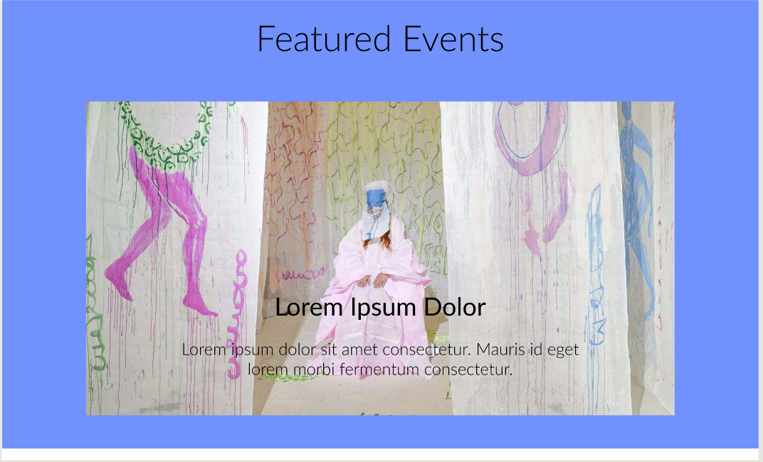
Featured events on the websites What’s On page had no obvious CTA buttons or timescale to inform users whether it was interactive and/or could be attended.
3.
Certain navigational features were not made immediately accessible for the users. Users were missing vital areas of the website as certain pages were missing from the main nav bar.
4.
Moderated Usability Study
This study was conducted to explore how well users were able to complete a set number of tasks using the Gallerio prototype. Participants were observed and interviewed and their data was collated to produce valuable findings and generate actionable insights.
Research Goal:
To inform the usability and ease of viewing and booking processes for upcoming events. I intended to also identify any pain points in the user flow and explore any additional features that could be implemented


Iterations made included a “return to top” button at the bottom of each page and a sticky nav bar that scrolled the page with the user
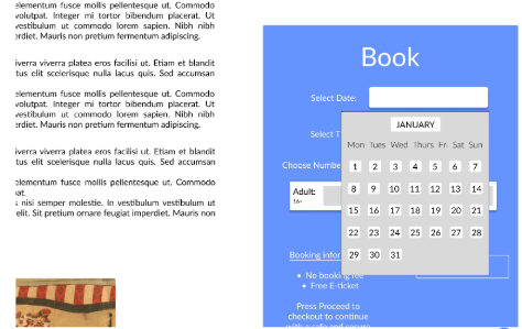
In order to improve the experience and account for accessibility requirements, I simply enlarged the text and text boxes within each section.


I added the duration of the event above the carousel feature and also included a CTA button to show users they could interact with that feature.

In an attempt to improve the sites IA and ease of navigation, I included subcategories that open up in a drop down function once users hover over each parent heading of the nav bar.
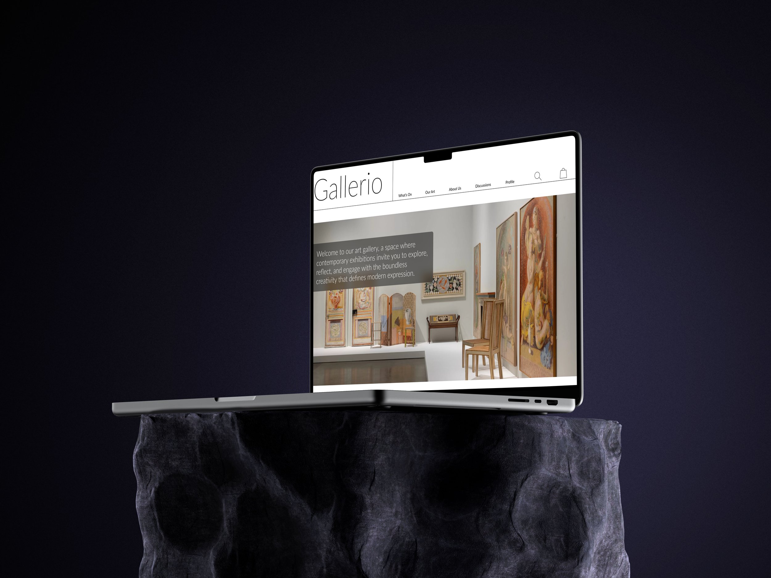
HI-FI Prototype
Takeaways
This project refined my web design skills, especially in adapting designs for different devices. It boosted my confidence in the design thinking process.
I learned that resilience is key—acknowledging mistakes and embracing feedback helps me grow as a designer, always keeping the user in mind.
“You have carefully captured the atmosphere of a physical gallery and museum within your website. The open, clean design makes for a really enjoyable experience. I can navigate it easily and I feel confident using it”
Add more micro interactions to enhance engagement and align with current website trends for a better user experience.
Consider adding discussions as a web feature, expanding beyond its current app-exclusive status.
Conduct a post-launch accessibility audit to identify and address barriers, improving the product's universal effectiveness.
Next Time….