BetterBites - Healthy Recipe Mobile App and Responsive Web Design
Case Study
Project Duration: February 2025 - April 2025
Role: UX/UI Designer
Responsibilities: Research, Wireframing, Prototyping, UI Design, Accessibility

Better Bites inspires individuals and families to enjoy healthy, delicious eating with a strong focus on nutrition. Through fun, accessible recipes, it promotes connection, self-care, and balanced living, making nutritious cooking joyful and exciting.
The problem:
Better Bites was created to make healthy, exciting, and nutritious meals more accessible. It addresses the lack of inspiration and time many face, offering a clear alternative to cluttered, overwhelming recipe sites that often discourage healthy cooking.
The Goal:
Better Bites solves these issues by offering a clean, simple, and engaging platform that makes nutritious cooking enjoyable and accessible for all. Users can access fun and exciting recipes, recieive inspiration using the power of AI, and keep on track with their personal nutritional goals and targets.
Understanding the Users
I conducted in-person interviews with 5 participants (aged between 18 - 60 who cooked for themselves and/for others) to explore their cooking habits, nutritional focus, and motivations when sourcing healthy recipes—gathering insights into their behaviours, desires, and challenges when preparing meals for themselves or their families.
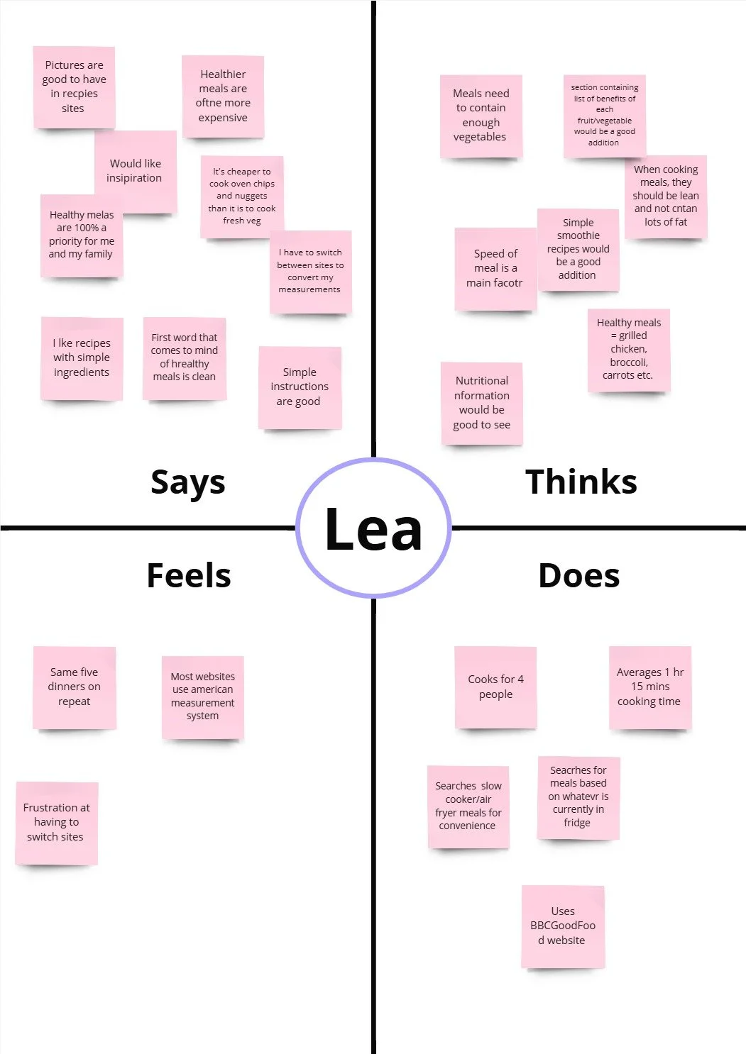
Empathy Mapping
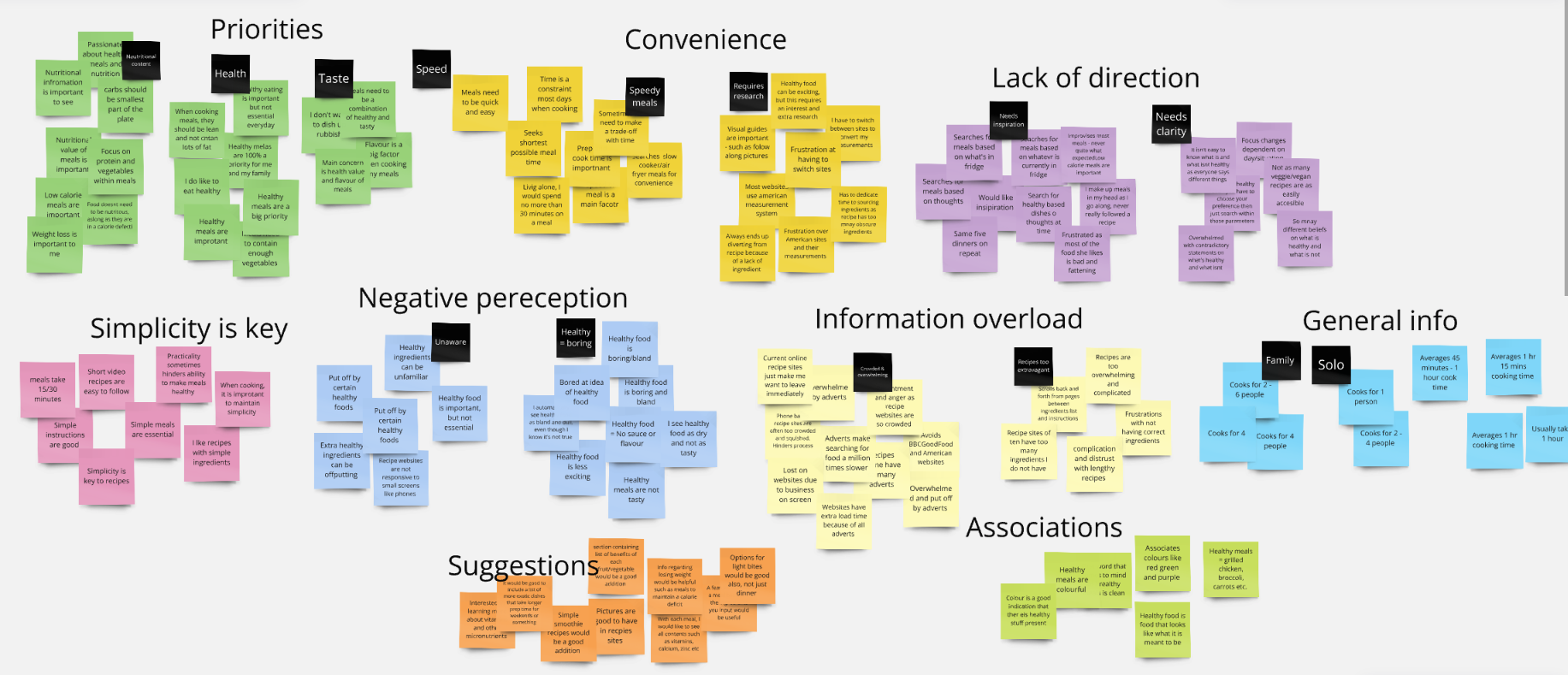
After the interviews, I synthesized the findings through empathy mapping—capturing participants’ thoughts, feelings, and actions—and used affinity mapping to identify common pain points related to finding, preparing, and cooking healthy meals via existing recipe platforms.


1
From the interviews conducted…
4 out of 5 participants said that time and simplicity were essential factors in their cooking process
5 out of 5 agreed that healthy meals were a priority to them
4 out of 5 said that current recipe websites were too overwhelming and crowded
3 out of 5 said that they feel healthy food can be dull and boring
4 out of 5 said that recipes have unrealistic ingredients
5 out of 5 expressed a need for inspiration and suggestions when it comes to meals
Current websites are crowded with ads, ruining their user experience and making it hard to find healthy meal recipes online.
2
Pain Points
Lack of options and inspiration results in users cooking the same few meals on repeat each week.
3
Most recipes require extravagant ingredients that many households simply do not have and are often quite long winded.
4
Healthy food is immediately associated with being dull and boring.
Defining the Issue
User Persona’s
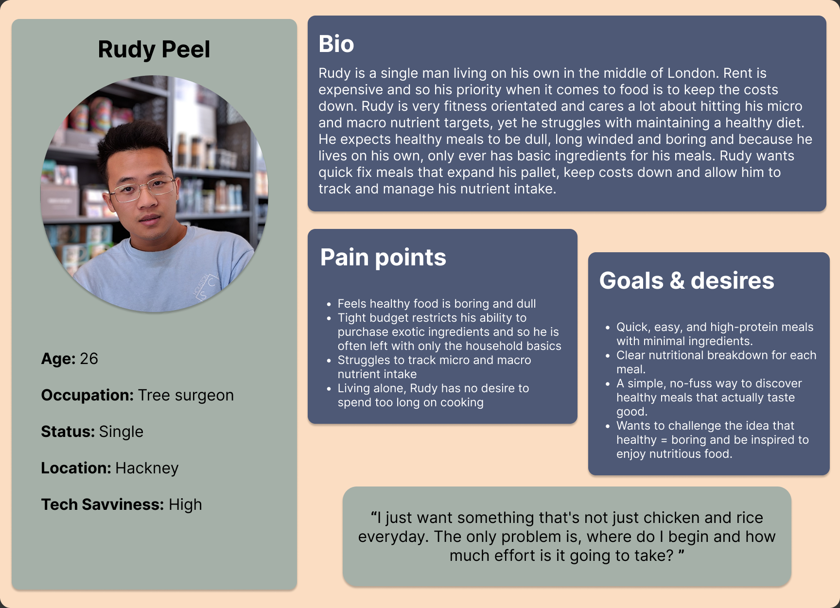
Problem statement:
Rudy wants to eat healthier and track his nutrition, but he struggles with the perception that healthy meals are boring and time-consuming. He needs a simple way to find quick, high-protein meals with minimal ingredients and clear nutritional information to support his active lifestyle.
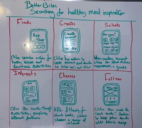
User Journey Maps


Problem statement:
Chloe is a busy mother who needs a simplistic and clutter free way to find healthy meal inspiration that will allow her to create fun, diverse and healthy dishes, that do not require an unrealistic set of ingredients, for herself and her family.
Based on user insights, I created journey maps to simulate typical experiences with online recipe platforms—highlighting pain points and opportunities where Better Bites could offer a more engaging and supportive experience.

Using insights gathered on users’ behaviours, needs, and motivations to clearly understand the core challenges they face. I then sought to identify key opportunity areas and shape a user-centred product vision focused on improving their overall experience.

BetterBites Problem Statement:
Health-conscious individuals often find healthy cooking time-consuming and uninspiring, highlighting the need for a simple, clutter-free solution that offers quick, enjoyable recipes with minimal ingredients and clear nutritional information to support both personal and family goals.
BetterBites Goal Statement:
Our healthy recipe website will offer easy access to fun, nutritious meals with clear nutritional info and engaging visuals—supporting health enthusiasts and busy parents with simple, inspiring recipes in a clean, distraction-free space.

Ideating the Solution
Competitive Audit
I conducted a competitive audit of key platforms—BBC Good Food, Jamie Oliver, Minimalist Baker, and Hello Fresh—focusing on strengths, weaknesses, and opportunities.
While most offered rich content and strong visuals, issues like cluttered ads, poor navigation, and slow load times were common.
I identified gaps for BetterBites such as a simplified, ad-free recipe builder and clearer support for beginners, with opportunities to stand out through features like AI-driven suggestions, nutritional tracking, and accessible content without sign-ups.

Storyboards: Big Picture & Close Up
Following this, I created both a big picture and a close-up storyboard to illustrate the user’s journey with BetterBites.
The goal was to visually represent how users discover and engage with the platform. The storyboards highlight the users' initial problems and then explore how BetterBites effectively addresses these challenges, providing relief and a seamless, enjoyable experience for the user.

Big Picture
Close Up
Idea Generation - How Might We
Moving onto idea generation, I used “How Might We” questions to spark ideas and guide user-centred solutions that addressed key challenges identified in earlier research.
How might we reduce user fatigue when searching for healthy recipes online?
How might we engage users more and improve their perceptions of healthy eating?
How might we provide useful nutritional information alongside each recipe?
How might we encourage users to continue to cook and eat healthy meals?
How might we make healthy meals more attainable and realistic for people to cook?

This helped me to transition nicely on to a rapid ideation exercise, with the aim being to generate a number of ideas for a mobile app that will encourage adults to cook healthier meals and provide solutions to the issues highlighted above.

User Flow
I designed a streamlined user flow to deliver a personalised and engaging experience from the start. Users set preferences during onboarding, tailoring their homepage instantly. The AI feature offers quick, customised recipe suggestions—reducing effort and adding immediate value.

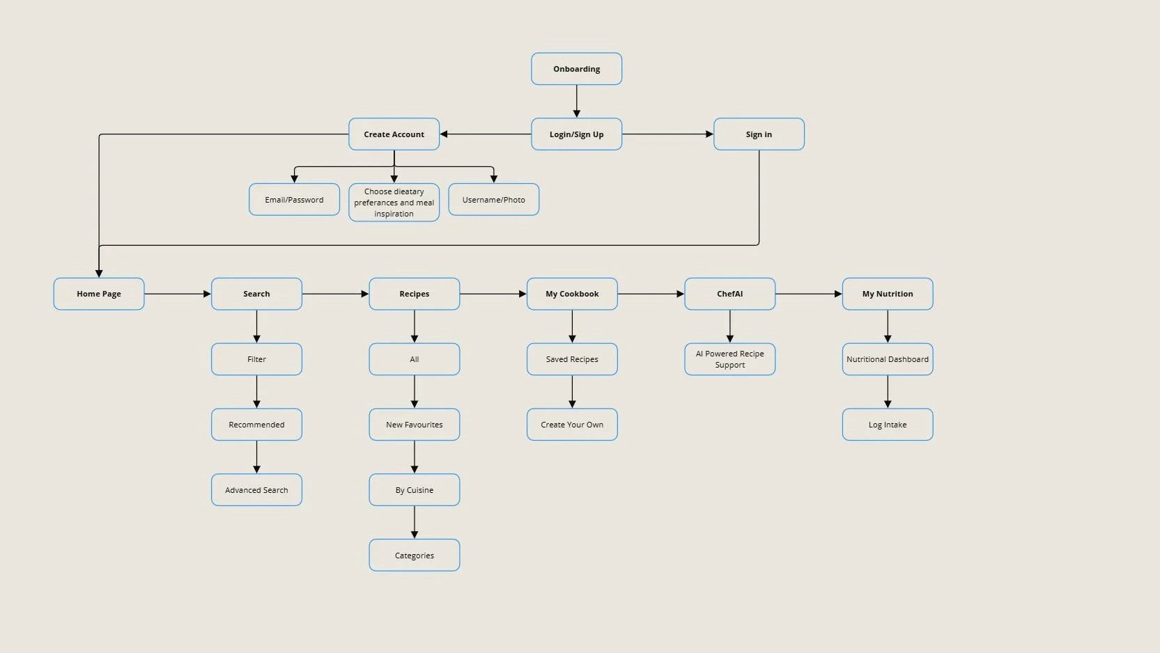
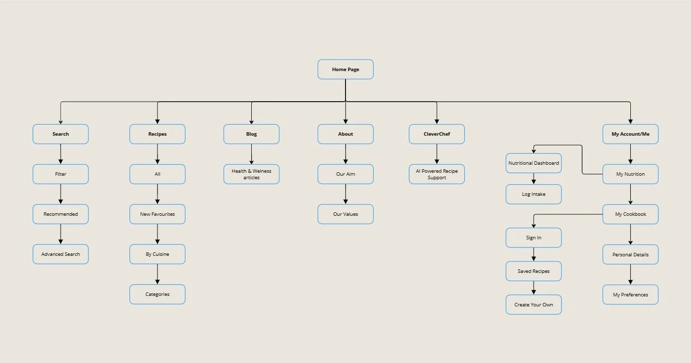
BetterBites App - Sitemap
This sitemap was thoughtfully structured to reflect users’ goals and preferences, prioritising a clear and intuitive layout.
The organisation of pages was carefully planned to support smooth navigation and create a user-friendly experience that makes discovering and interacting with healthy recipes both simple and engaging.
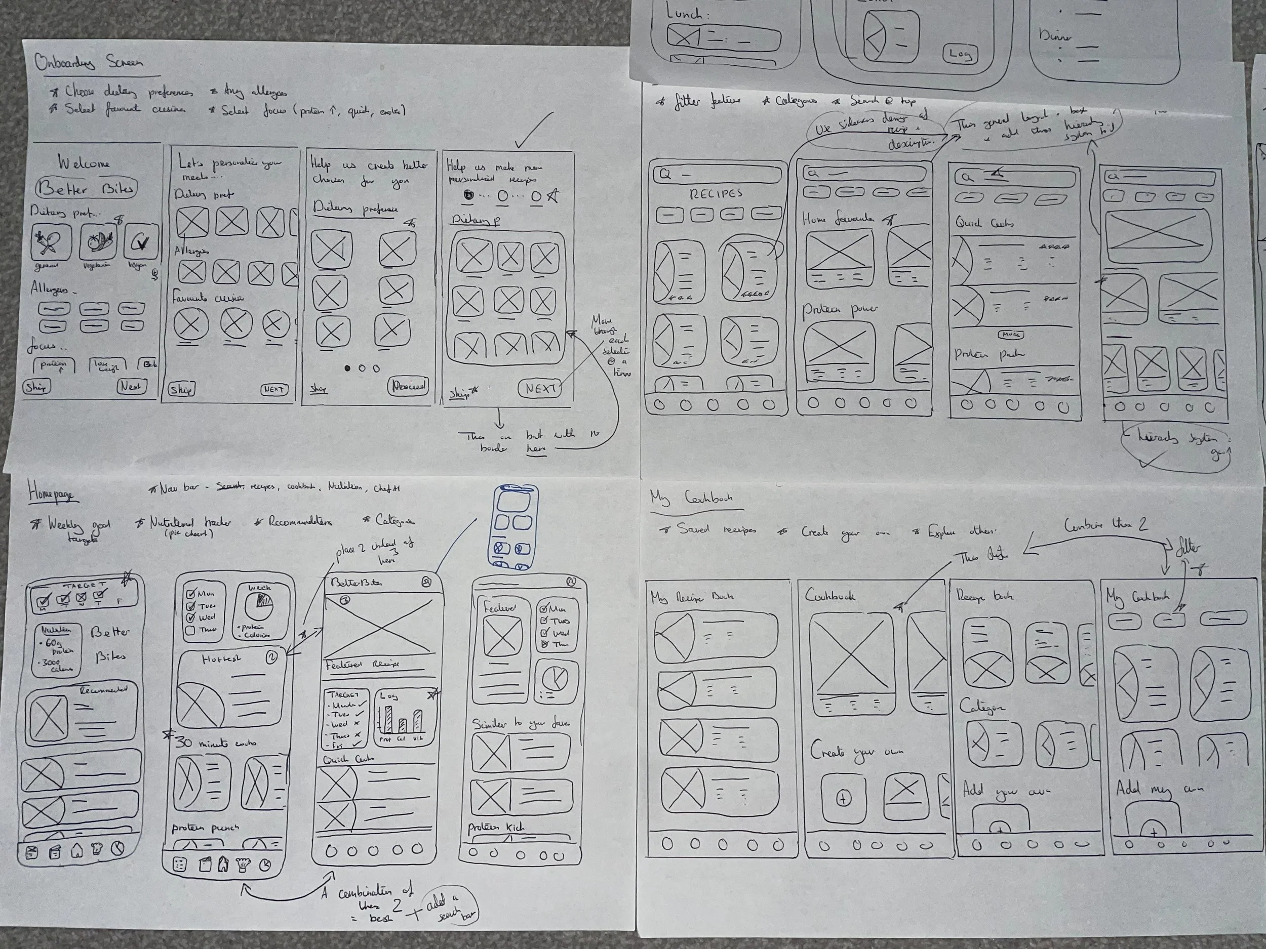
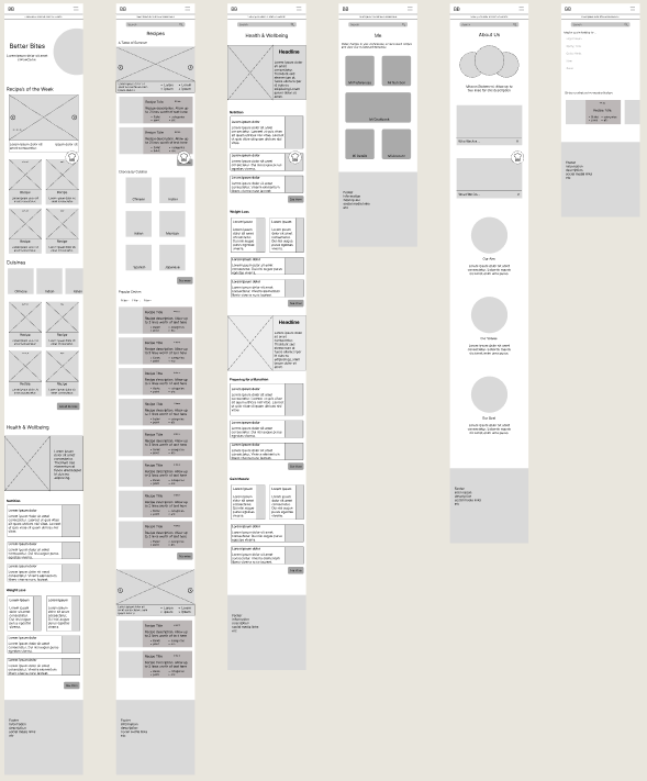
Paper Wireframes
During paper wireframing, I sketched multiple layout variations for key pages, focusing on clarity and usability.
Feature goals were added to each wireframe to keep designs aligned with user needs. Once satisfied, I moved to Figma to digitise the wireframes and refine the visual designs.

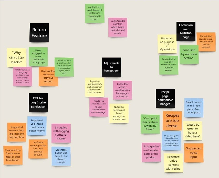
Usability Study
After developing the Lo-Fi prototype for BetterBites, I ran usability tests with five participants to gather feedback on functionality and ease of use.
Using affinity mapping, I identified key patterns and insights to guide the next stage of design and ensure alignment with user needs.
4 out of 5 users expressed frustration with not being able to return to previous page with a back button.
3 out of 5 users displayed confusion regarding logging each recipes nutritional information.
5 out of 5 users commented on issues with the recipe page - suggesting a number of changes could be made.
3 out of 5 users failed to see the significance of the nutrition page; appearing uninterested and unaware of the features use.
2 out of 5 users found the homepage was lacking important features of the application.
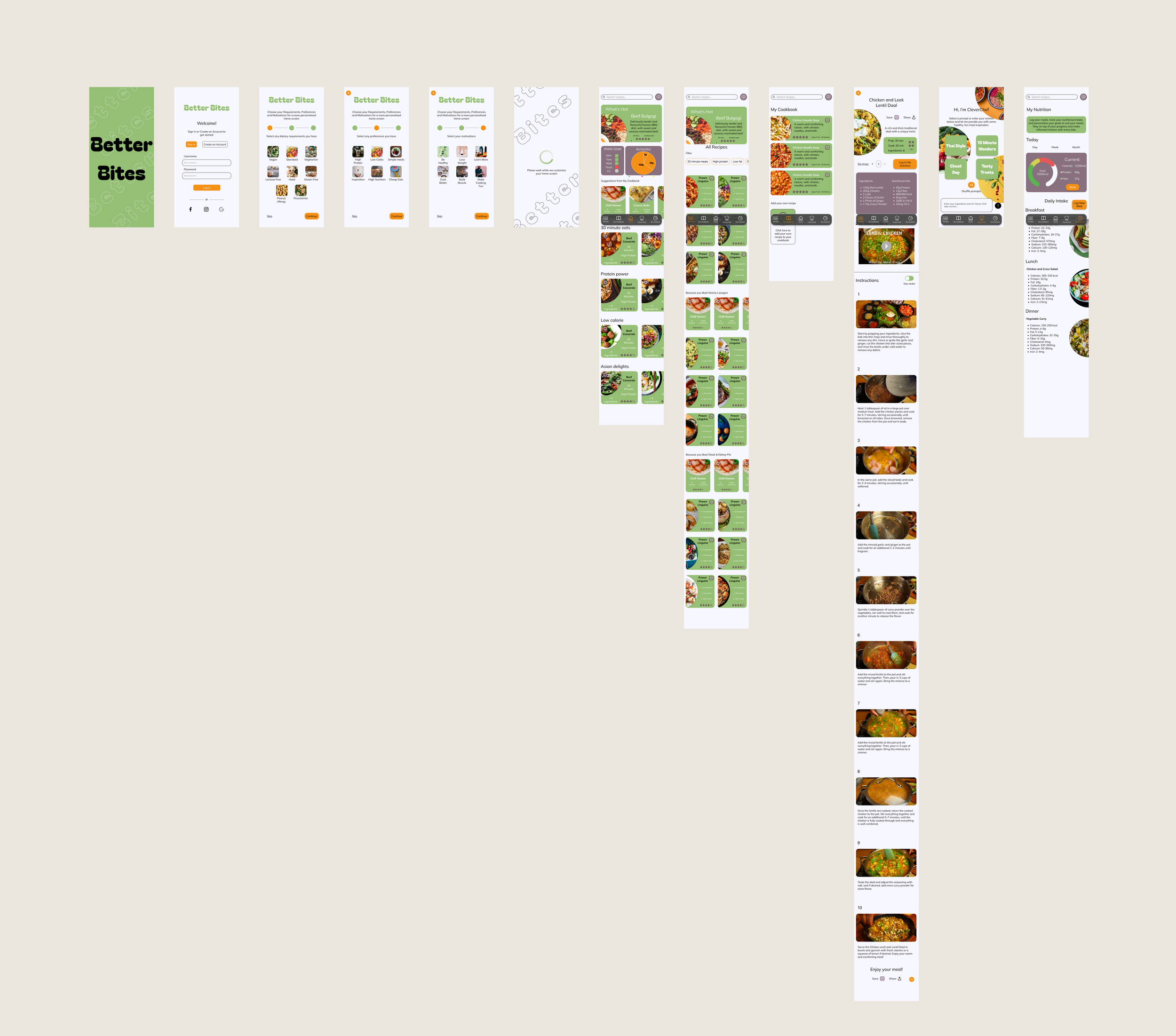
Following the changes made as a result of the usability study, I proceeded with the development of my product - creating Hi-Fi versions of each page to bring the app to life.
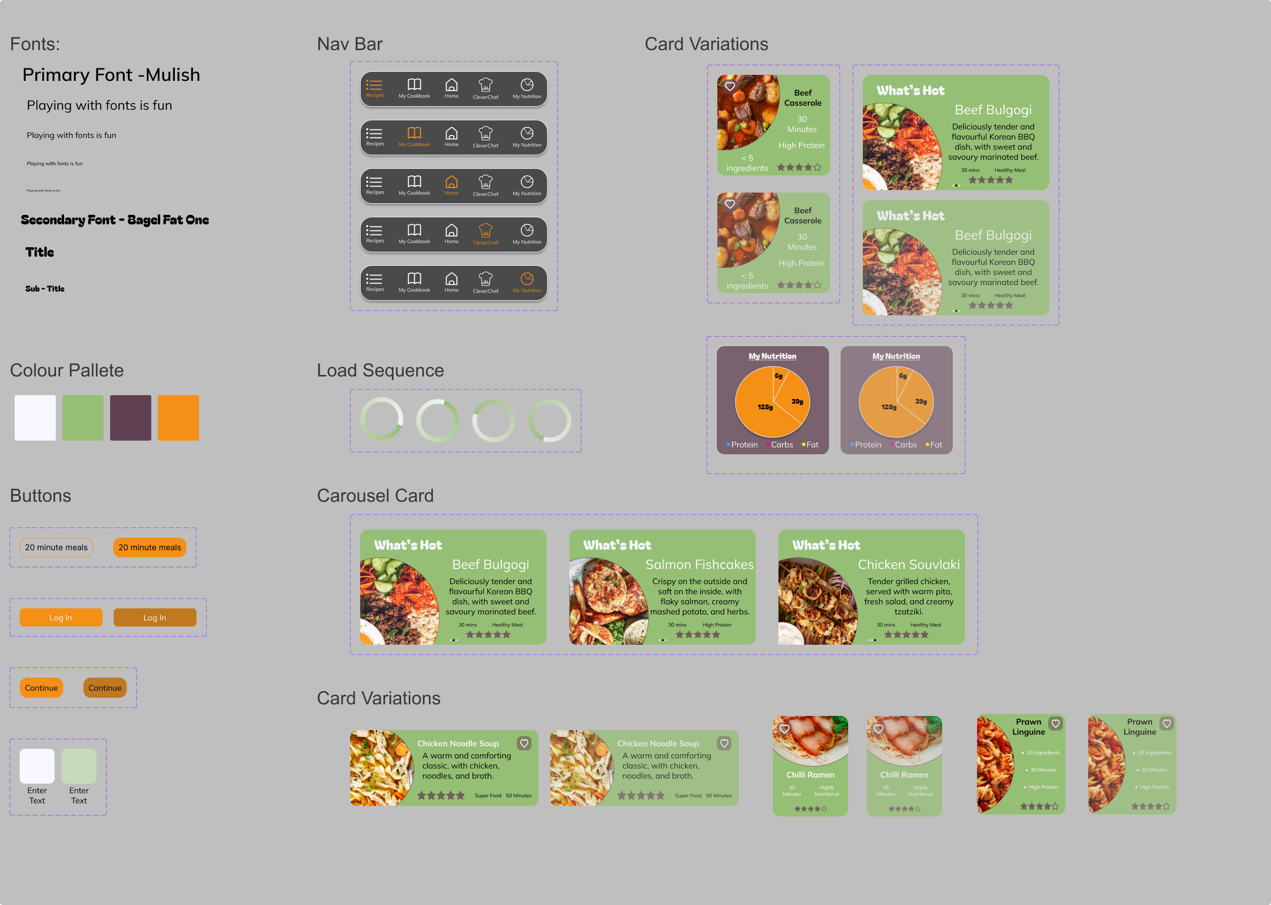
Sticker Sheet
Hi-Fi Mockups
Testing the Product
Further Revisions
With the updated high-fidelity mockup, I conducted a second round of usability testing focused on a more realistic version of the product.
This refined study built on earlier insights, aiming to validate design improvements and gather deeper feedback on the overall user experience.
A usability study took place with 5 participants to explore how well they were able to complete a set number of tasks using the high fidelity prototype. Participants were observed and interviewed and their data was collated to produce realistic findings and generate actionable insights.
Outcomes
Elements of the Recipe page, cookbook, and homscreen require a redesign in order to account for missing features, accesibility issues and include additonal text/descriptions.
The product lacks strong visual hiearchy in terms of text, CTA's and images and requires a redesign
The CleverChef feature is not intuitive enough for users and requires better explanations on screen
Findings:
Insights:

An audit of the products information hiearchy will be completed - assessing typography and visual hiearchy.
Reconsider the products usability and interaction features, ensuring CTA's are obvious, additional features are included and ensure that accessiblity is consdiered thoughout.
The CleverChef feature would benefit from an improvment in clarity to show the power and benefit of the AI feature.
From the information gathered, an affinity map was created to help synthesize the data and identify any further shared issues that users experienced with the product.

Revised Designs
Before


After

The second usability study showed that 3 out of 5 users didn’t realise CleverChef was AI-driven. I revised descriptions and prompts to clarify its purpose and adjusted background opacity to improve readability and overall user experience.
Before
After

A key issue was poor visual hierarchy, making navigation unclear. I addressed this by introducing a secondary heading font and increasing bold text to guide the eye and highlight key features, improving overall usability.
Before

After

Accessibility concerns arose from limited dietary options. I added a text search box, enabling users to input a wider range of needs, making the feature more inclusive and flexible.
Before
After

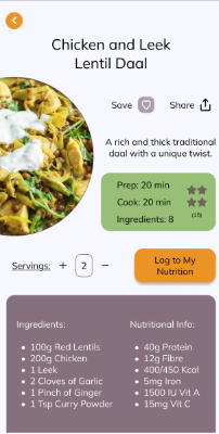
Based on user feedback, I added a motivational statement under the target element to encourage healthy eating, and introduced a “create specific cookbook” feature to enhance personalisation and user control.
Hi-Fi Prototype
Website Design
An Approach with Progressive Enhancement
After completing the mobile app, I developed a responsive website using a mobile-first approach. This ensured core features were prioritised before scaling up to the desktop experience.
Remodelled Sitemap
To support the transition from mobile to desktop, I adapted the original sitemap to suit a wider, more flexible layout. This updated sitemap maintains a user-centred structure while expanding navigation options and enhancing discoverability of features, ensuring a seamless and intuitive experience across all devices.
The Wireframing Process
With user research, needs, pain points, and competitive analysis already established, I revised the sitemap for the website.
Taking a mobile-first approach, I then created multiple iterations for each page, focusing on layouts and elements that could scale effectively to larger screens while reinforcing the product’s core features.
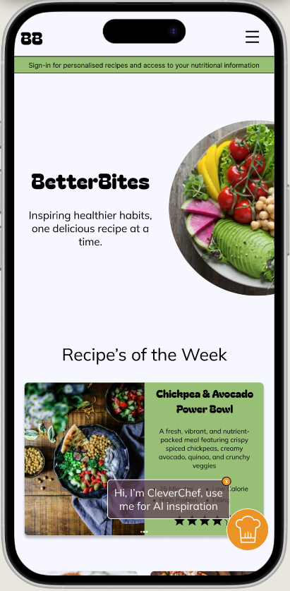
Hi-Fi Mockups - Mobile Website


Tablet Mockup - Homescreen
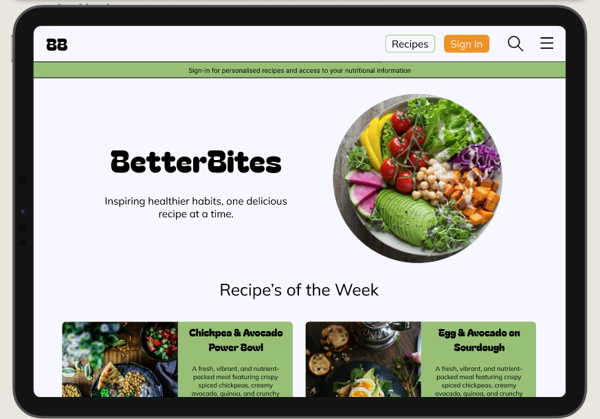

Desktop Mockup - Homescreen
Takeaways
What I learned….
I found this process very informative. constantly evolving my personal skill set, I enjoyed the learning process and learnt that it only takes a handful of people to generate a high volume of useful insights - seeing the power of user research.
1
To enhance usability and user experience, BetterBites should conduct more usability studies, optimize navigation based on user feedback, and improve accessibility with features like better color contrast and adjustable text sizes.
Impact….
“This app really helps to save me time in the future. I can find super fun AND healthy meals that can be adapted based on serving size. The easy, navigable format and the simple instructions make it a walk in the park. I love that CleverChef feature also”
Next Steps:
2
Expanding app features could include shopping list integration, meal planning tools, and community features such as forums or recipe sharing.
3
For monetization and business growth, BetterBites could introduce a premium version with exclusive content, partner with food brands for affiliate marketing, and explore subscription models for additional features like personalized coaching.