East London Waterworks Project - Website Redesign
Team Volunteering Project
Project Duration: January - Present
Role: UX/UI Designer, Research Support
Responsibilities: Research, Wireframing, Prototyping, UI Design
Project Overview:
The East London Waterworks Park (ELWP) is a bold and community-led project that aims to transform a disused Thames Water depot in East London into the UK’s first community-owned swimming ponds. The initiative promotes sustainability, wellbeing, and community regeneration by returning the land to nature and local people. It stands as a powerful example of ecological activism and grassroots collaboration.
Our volunteer UX team has come together to redesign the ELWP website with three main goals:
Improve the user experience and navigation.
Encourage volunteer sign-ups and strengthen engagement.
Create a digital space that builds a sense of community and inspires continued involvement.
My responsibilities
As a Volunteer UX Designer, I collaborated closely with a small team throughout the project, contributing across research, strategy, and design while leveraging industry tools like FigJam and Figma to streamline our process. My key responsibilities included:
Conducting a UX audit to identify usability issues and improvement opportunities.
Contributing to team workshops to align on ELWP’s mission and user needs.
Creating and iterating user personas based on real volunteer feedback.
Using FigJam for collaborative insight mapping, journey planning, and ideation.
Defining benchmarks to keep the project focused and goal-driven.
Incorporating stakeholder feedback to refine solutions and improve accuracy.
Ensuring adherence to the established style guide by communicating with fellow designers to maintain consistency with ELWP’s brand and community values in high-fidelity mockups.
Designing responsive wireframes, contributing to both desktop and mobile.
Careful consideration of user goals and motivations when designing desktop pages - joint UI lead.
Adapting wireframes and leading UI transformation for mobile screens.
Maintaining regular communication with the team to ensure design cohesion.
Empathise
Understanding the Problem and the People
We kicked off the project with open team discussions, where we shared ideas and built a collective understanding of ELWP’s mission and long-term vision.
Together, we defined who our core users were—especially volunteers, local supporters, and first-time visitors—by drawing from real experiences and insights.
We also mapped out the site’s intended role in building community and encouraging long-term engagement.
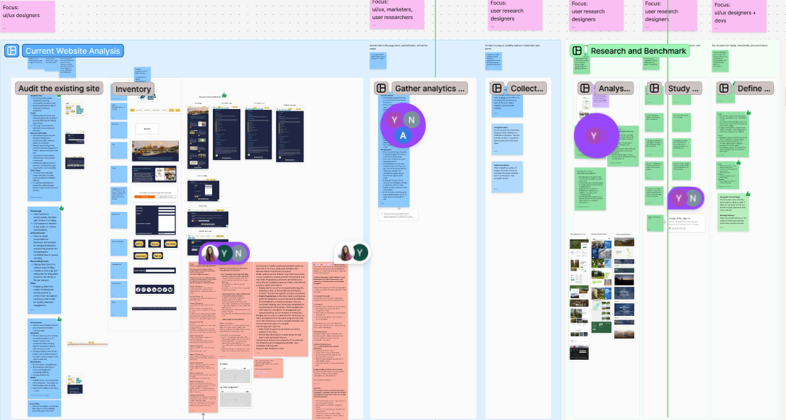
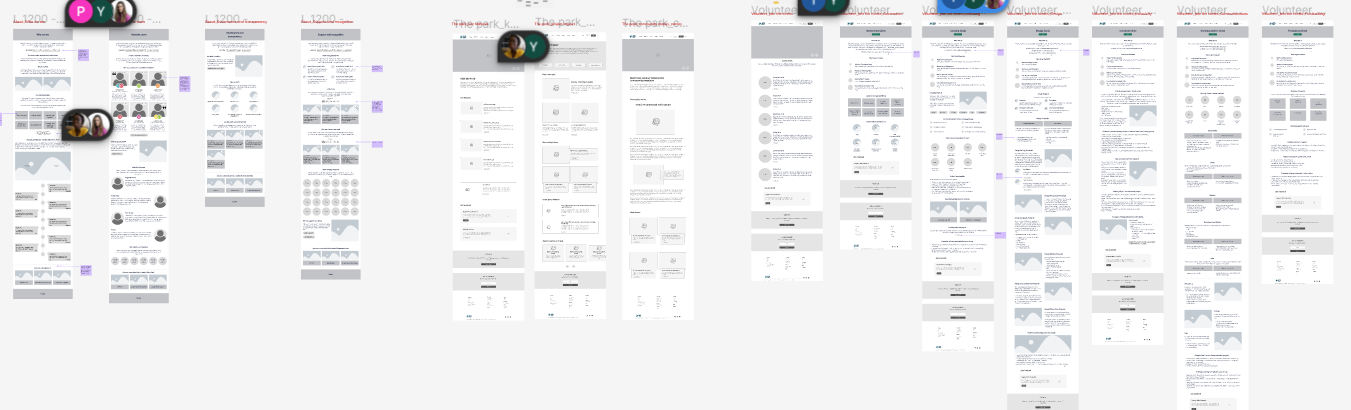
Auditing the Exisitng Website
As a team, we conducted a detailed analysis of the existing ELWP website, examining its structure, usability, and accessibility.
This involved reviewing navigation flow, content clarity, visual hierarchy, and how well the site adhered to basic accessibility guidelines such as colour contrast, text readability, and alt-text implementation.


Current Website
We used FigJam to map team feedback, revealing shared pain points like confusing journeys, inconsistent design, and inaccessible content—informing our redesign priorities.
Volunteers analysed web analytics to complement our qualitative findings, offering insights into current user behaviour. By integrating this data with FigJam observations, we collaboratively refined a redesign strategy that was both data-driven and empathetic to user needs.
Define
Clarifying Goals and Synthesising Insights
Although the overall goal was a redesign, we honed in on specific user flows to focus our efforts where it mattered most. We recognised early on that while the site needed a full visual and functional overhaul, it was essential that our design solutions were grounded in real user needs, motivations, and pain points.
Our Persona’s
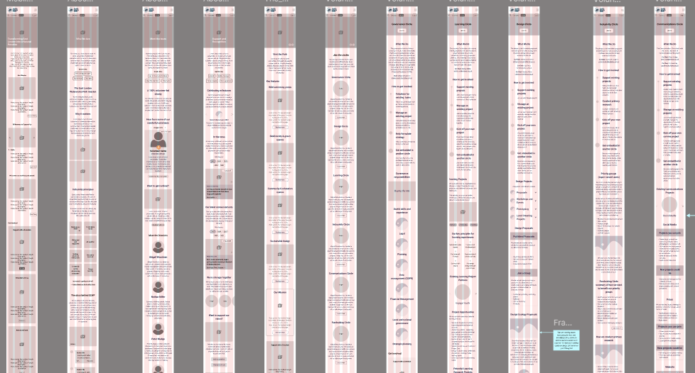
We created and refined 11 diverse user personas to keep real users— from local volunteers to curious visitors—at the heart of our design, ensuring alignment with their expectations and behaviours.
Internal volunteers
Donors
Prospective joiners
Underserved communities
Government decision makers
Collaborators (Research)
Collaborators (Learning)
Collaborators (Co-Design)
Curious about our work
Curious about the parks status
Property developer
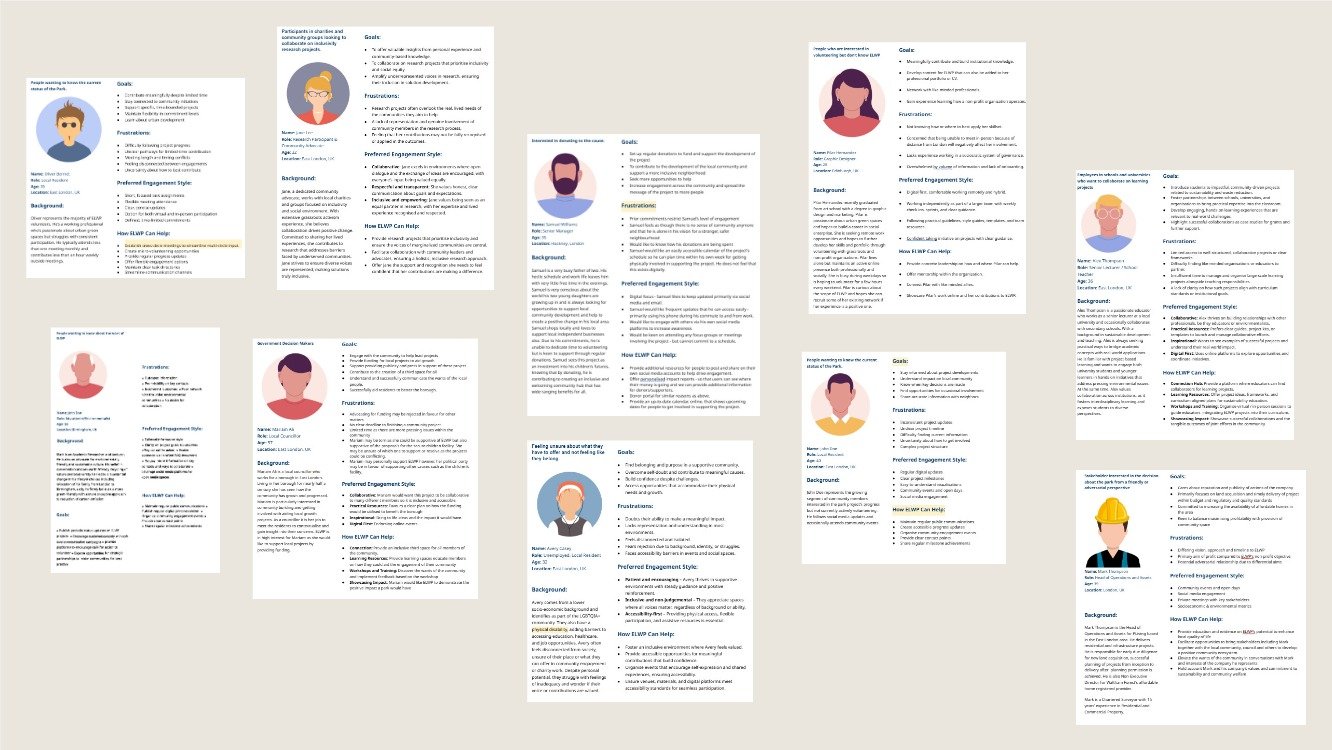
We shared each persona in Slack for organisation-wide feedback, using insights to refine and ensure they accurately reflected user needs, motivations, and behaviours.
Our mission statement became clear
To redesign the ELWP website in a way that improves usability and accessibility, fosters a sense of community, encourages volunteer engagement and retention, and reflects the welcoming, eco-conscious ethos of the organisation. We aimed to create a seamless and engaging experience that supports the platform’s growth while remaining true to its grassroots spirit.

Benchmarks and Design Guidelines
Meetings with stakeholders and project leads helped us establish...
Clear benchmarks for success: accessibility improvements, streamlined navigation, and increased volunteer sign-ups
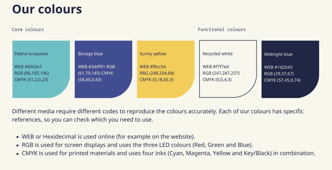
A style guide to inform future designs which reflected ELWP’s natural, earthy brand identity, using organic shapes, calm colours, and inclusive imagery

Ideate
Brainstorming and Wireframing
Using insights from personas, competitor analysis, and style guidelines, we collaboratively developed desktop-first wireframes.
I worked on developing both the desktop and mobile wireframes, maintaining consistency throughout design to ensure full responsiveness and accessibility
I helped coordinate team workflow, preventing design overlap and maintaining a consistent approach
We refined key user flows, particularly focusing on event sign-ups and volunteer onboarding
Modifying and iterating upon the style and layout of the design throughout the process
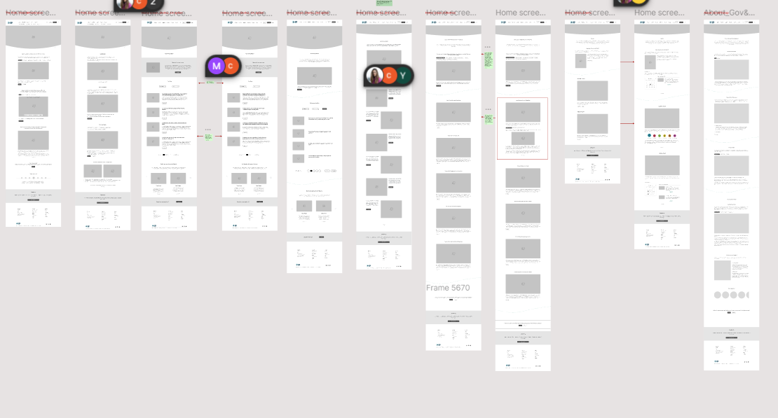
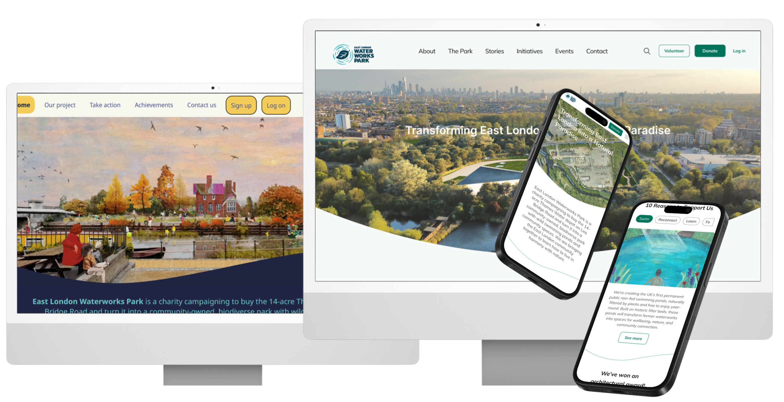
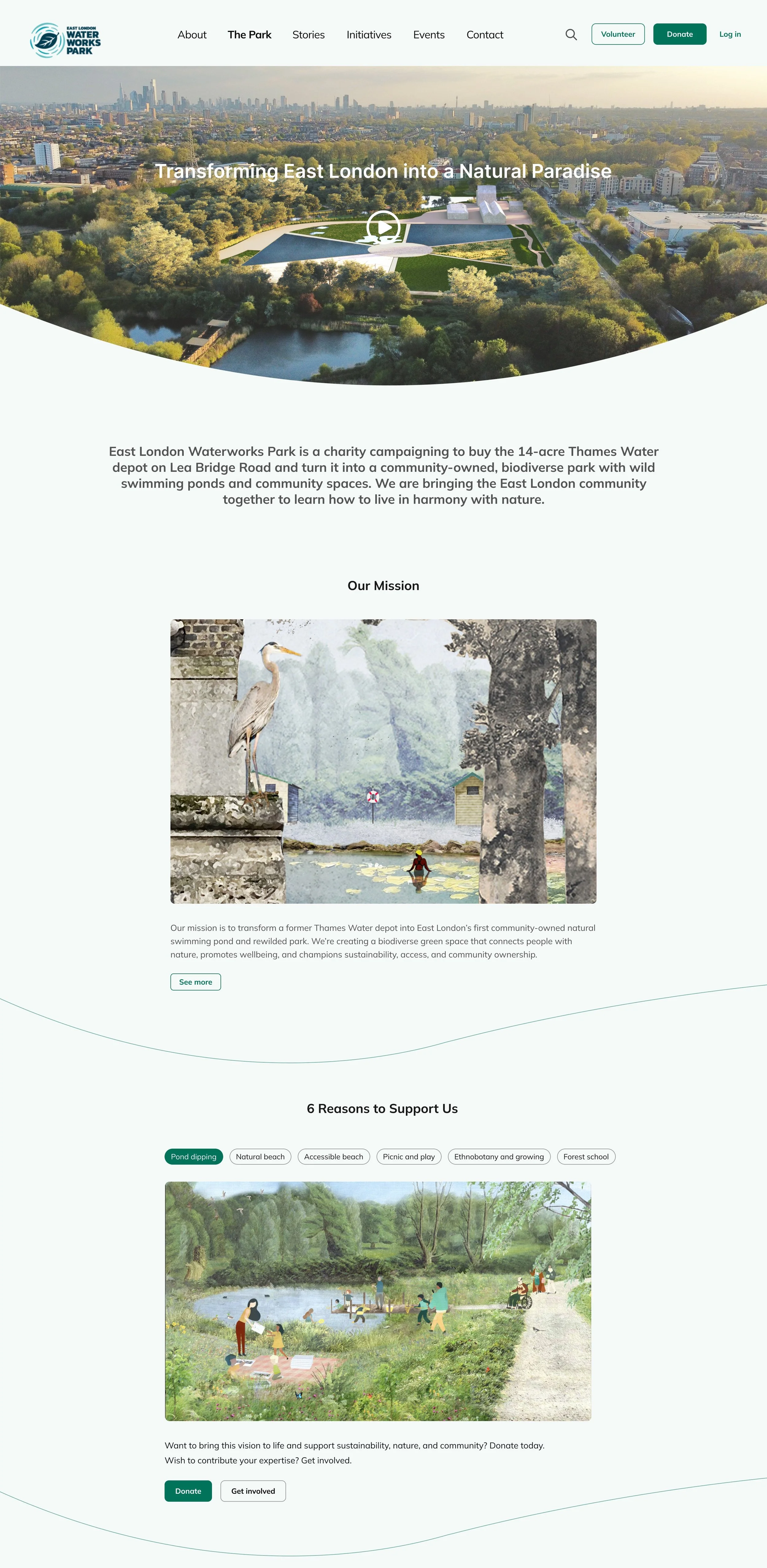
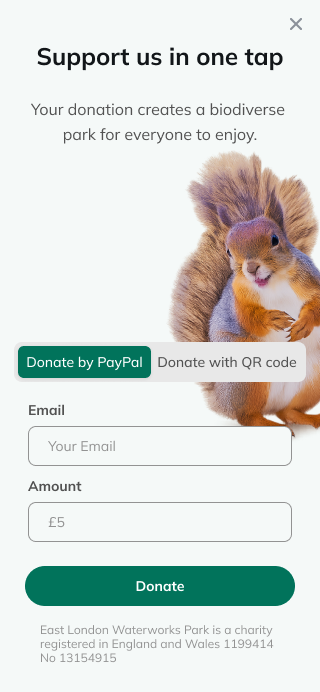
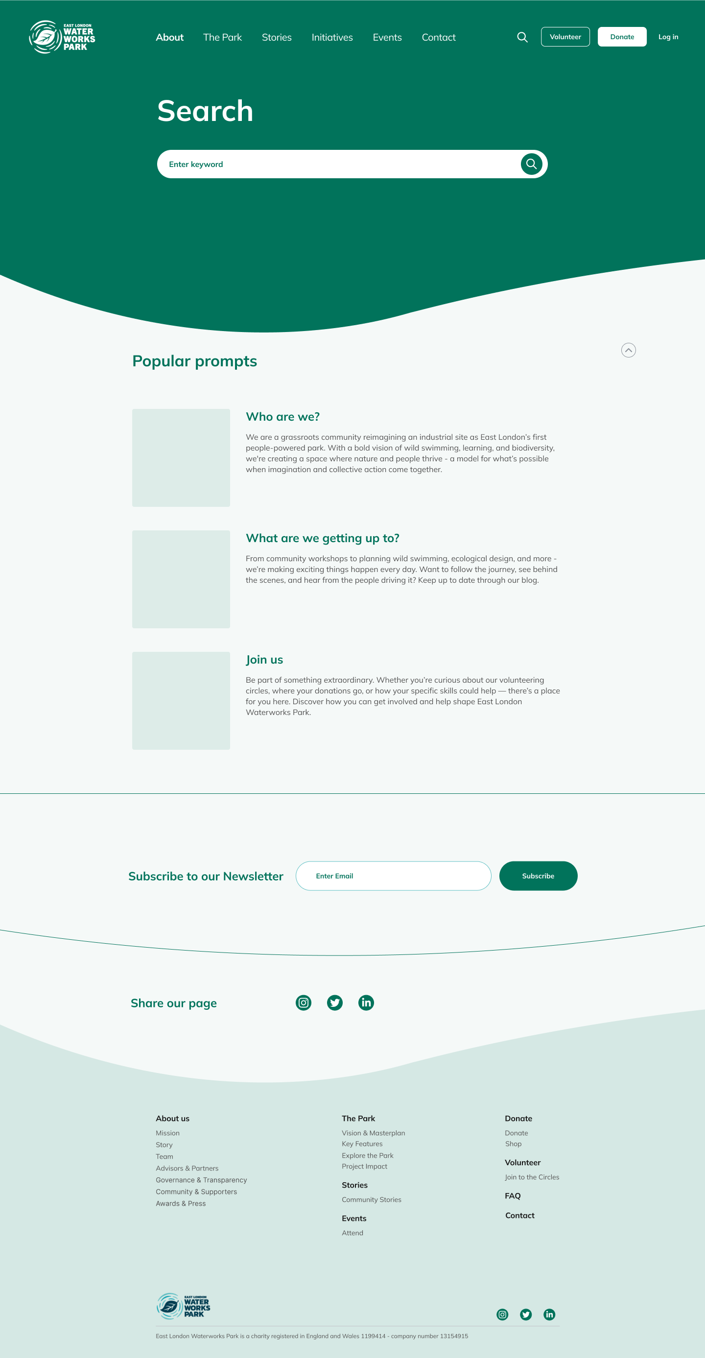
Desktop Homepage

Mobile Homepage

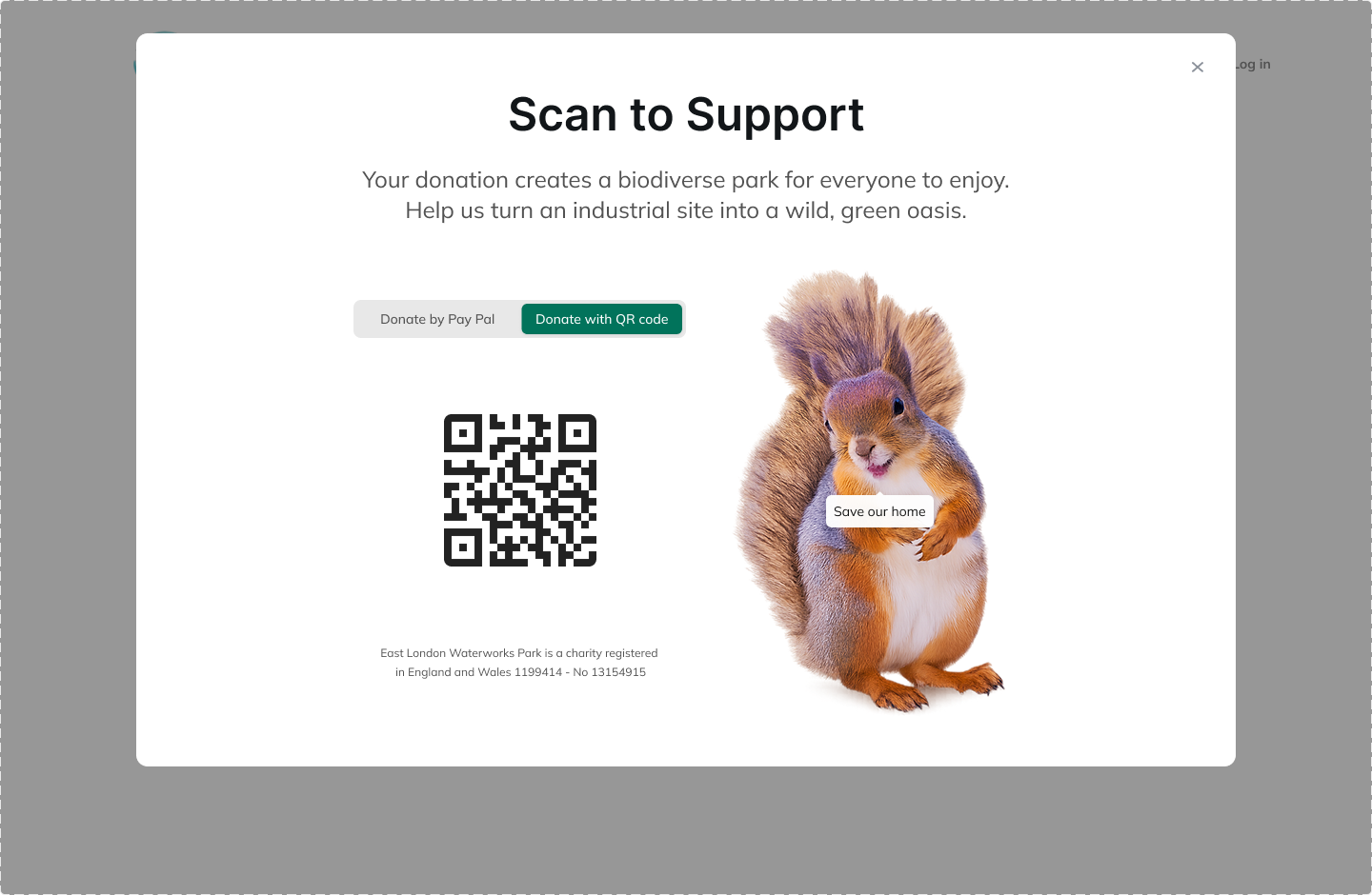
Conversion process


We then shared these wireframes with other ELWP volunteers to gain input on content placement, text choices, and visual hierarchy. This feedback shaped our design iterations moving forward.
Development of Hi-Fidelity Mockups and Design System
As we progressed, we began creating hi-fidelity mockups based on the established style guide and early wireframes.
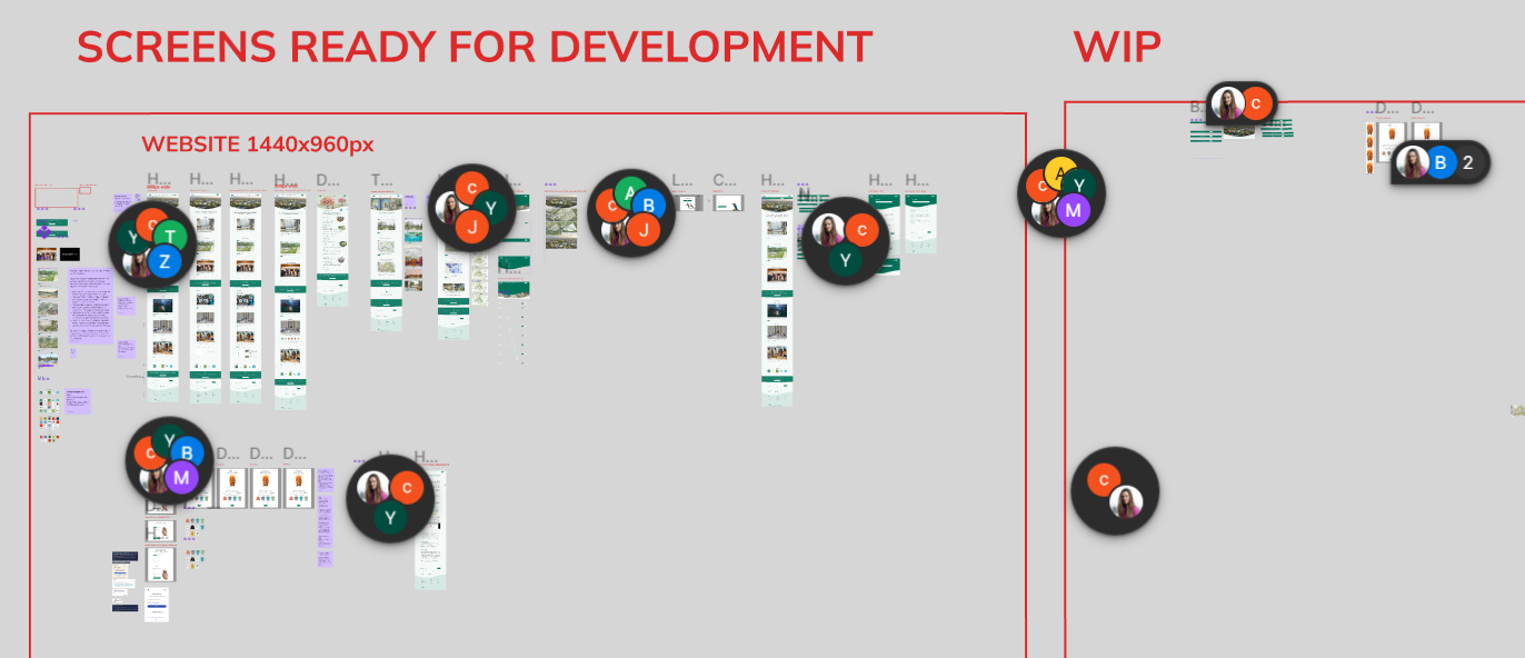
Working with a deadline in mind, we maintained good communication with the development team, handing off completed pages for development, whilst continuing to finish the rest of the designs.
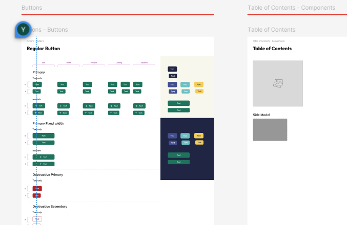
We developed a collaborative design system to ensure visual consistency across the site, covering typography, colour palette, buttons, navigation, and accessibility.
Multiple iterations of key elements—such as the navigation bar, buttons, and imagery—were created for ELWP volunteers to review and discuss.
Hi-fi mockups were then shared with the wider team to guide decisions on content, typography, and visual direction. Throughout the process, we maintained an open feedback loop to enable rapid, collaborative iteration and ensure the final designs aligned with ELWP’s goals.

The initial mockups were based on ELWP’s existing style guide, using imagery inspired by volunteer illustrations, site projections, and past events to reflect the community's vision.
After sharing the wireframes with volunteers, we received feedback on layout, wording, visual hierarchy, and accessibility. A follow-up meeting led to further suggestions, prompting a redesign that, while subtle, resulted in a sleeker and more refined aesthetic with a greater focus on accessibility needs.
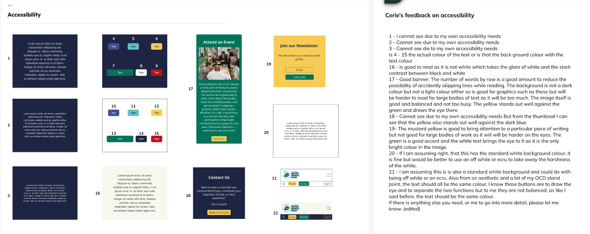
Accessibility Test
Homescreen Iterations
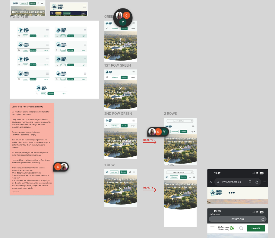
Oldest


Across three iterations of the homepage, the design evolved to become less visually cluttered and more user-friendly.
Early versions were visually dense and risked cognitive overload due to competing elements and a bold colour scheme.
In response to feedback, we refined the colourway to create a calmer, more accessible aesthetic and introduced clearer visual hierarchy. Additional UI elements such as section dividers were added—subtly shaped like the River Lea itself—to reflect ELWP’s identity while improving content structure and navigation.
Newest

Iterations of Key Elements
Development of Design System
Initial Mockups
Continued Development
As the project progressed, so did the designs. I began taking on more responsibility, assisting with the UI development for both mobile and desktop designs. With a focus on maintaining a clean interface that reflected the brand and direction of the ELWP.
Adhering to the design system and collaborating with the design lead, we began finalising the main user flows and sending them off to the development team. Here I was able to demonstrate my skills with micro animations also; creating animations within the pages to help the development team with replicating our vision into a tangible product.
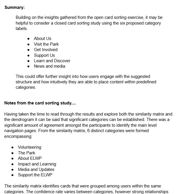
Card Sorting Review
With a dedicated team of UX Researchers as part of the project, little research was conducted primarily by msyelf, I was, however, able to access the most recent Card Sorting Study results and provide some analysis and insights based upon my interpretation.
I found this to be a hugely useful exercise, adopting more of an analytical point of view to consdier how the results affected our current presentation of information. Through my report, I analyse the dendrogram and similarity matrix provided by the study and explore how the results can be synthesised into actionable changes in our information architecture.
https://docs.google.com/document/d/1E8MTQRU44SKsajOFsaXg6ZjzEJH5gIDzz3r-x30qd6U/edit?usp=sharing
Moving Forward with a Goal
We continued to maintain open feedback loops between developers, designers, and stakeholders, enabling ongoing iteration and refinement of both mobile and desktop designs.
As the project progressed, I took on additional responsibility as a secondary designer, supporting the onboarding of new team members and providing constructive, actionable feedback to ensure smooth integration into the workflow.
Throughout, our designs, imagery, and content were carefully crafted to reflect the values and identity of the ELWP, ensuring its digital presence truly embodied the organisation’s mission.
Maintaining a user-centric approach, we consistently applied accessibility standards, heuristic principles, and visual design best practices to create designs that were both appropriate and powerfully effective for the intended audience.
Present Day - Timeline
As the project progresses, our focus is on continuing to refine the hi-fidelity mobile and desktop designs, maintaining alignment with ELWP’s goals through regular feedback, and ensuring consistency across platforms. We’re collaborating organisation-wide to finalise content, style, and navigation, creating interactive Figma prototypes for usability testing, supporting developers with initial builds, and continuously iterating based on user feedback.

What has this process taught me?
This project has been my most valuable experience so far, giving me real-world, hands-on involvement in UX/UI design.
I’ve grown into a more confident and capable designer through collaboration, leadership, and communication with designers and stakeholders. Mentorship from experienced team members has been key to my development.
Contributing to a tangible product has shifted me from learning in theory to applying my skills in practice. I now look forward to continuing this growth through more voluntary projects.