Gallerio - Mobile App Case Study
Project Duration: January 2025 - February 2025
Role: UX/UI Designer
Responsibilities: Research, Wireframing, Prototyping, UI Design, Accessibility
A mobile application that blends the simplicity and elegance of modern design with a creative and artistic flair. Providing an intuitive and comforting user experience that both solves real user issues and strongly reflects the institution it is a part of.
The Problem:
Art enthusiasts often miss events and exhibitions due to daily demands and limited access to information. Finding like-minded individuals to connect with is also difficult, leaving users unable to easily discover, book, or enjoy the cultural experiences they love.
Empathise
Early Stage Exploration - Empathy Map
Pain Points
1.
Define
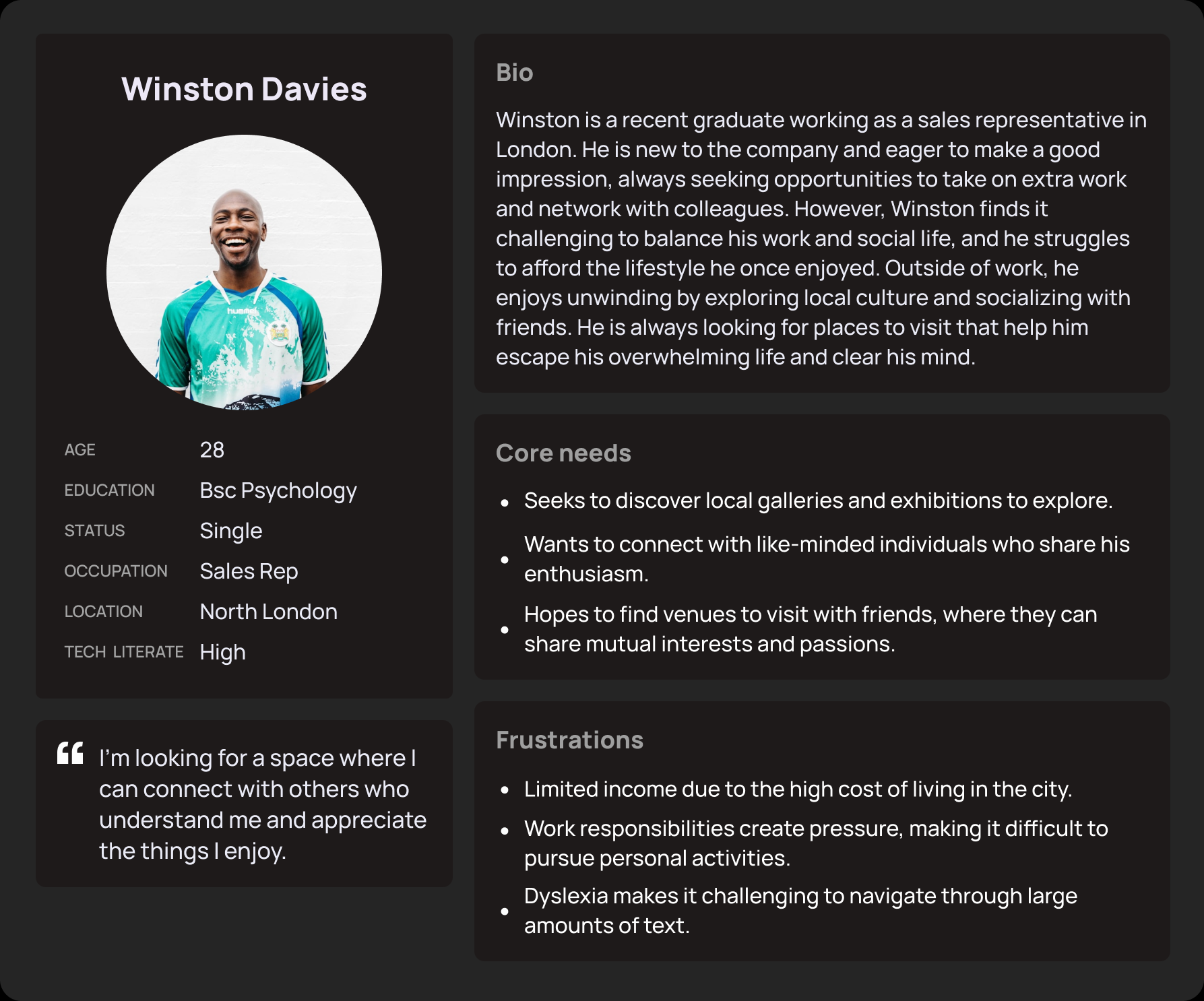
User Persona’s
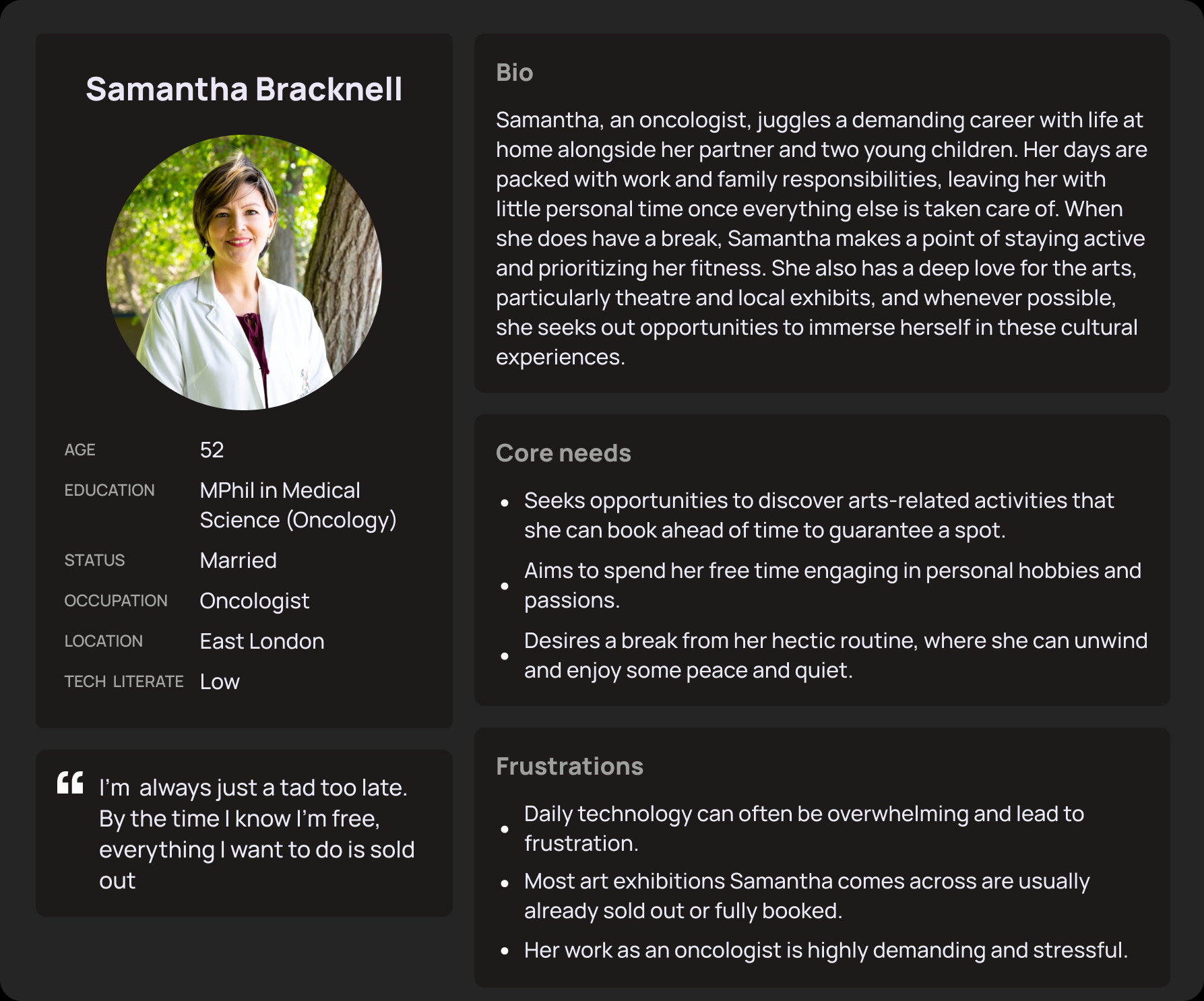

The Goal:
Gallerio's goal was to create a platform where users can easily view, save, and book upcoming events in just three clicks, ensuring they never miss out again.
Exploring the needs, motivations and desires through a deep analysis of user bios, I was able to gain an idea of some common patterns and experiences amongst each person.
This helped to paint a picture in my mind about who my actual user base would consist of; building the strong sense of empathy needed for the foundations of my user-centric approach and to avoid any assumptions on my behalf.
To further enhance my approach of a user-centred design, I compiled the user data into an empathy map.
Gaining an insight into the thoughts, feelings, actions and quotes of potential users helped me to remain focussed on the central part of my design………… the user.
The user often misses exhibitions due to late information and wants to stay updated on upcoming events.
3.
Work responsibilities leave little time for the user to enjoy art and culture.
All of the above helped to inform the development of my…
Identified Gaps: No membership hierarchy, no rewards for returning users, no ticket availability indicator.
Opportunities: Introduce membership tiers with benefits, offer perks for returning users, display ticket availability for events.
2.
4.
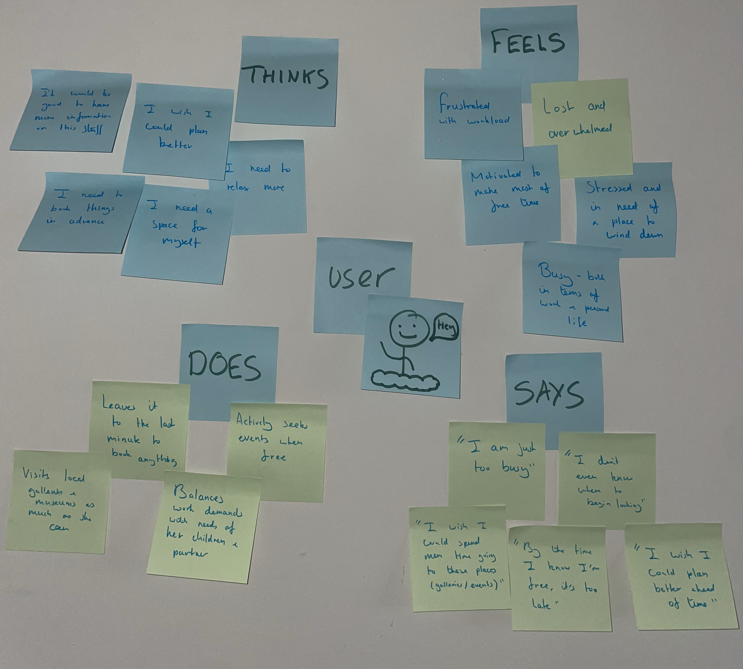
A limited budget makes it hard for the user to engage in preferred activities without overspending.
The user needs a simple, easy-to-navigate product due to visual needs and time constraints

-
If Samantha downloads an app that allows her to find and filter upcoming art exhibitions and events based on her preferences that allows her to save and pre book in advance, then she will be able to plan better for the things she enjoys and will avoid missing out in the future.
-
If Winston finds an app that provides information on upcoming exhibitions and events that he has preselected which also provides online discussion forums for people to meet and talk in regarding the specific event/artist, then he will be able to mix and socialise with people similar to himself, providing him with an opportunity to build relationships and unwind after work.
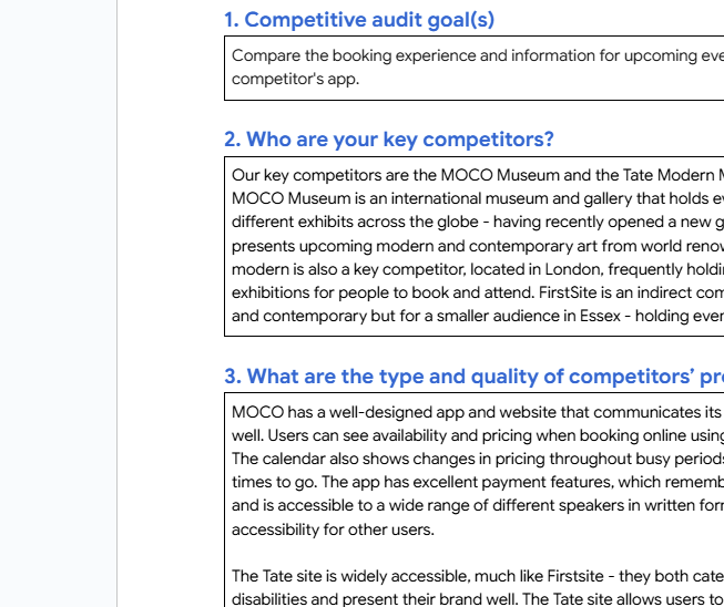
Competitive Audit
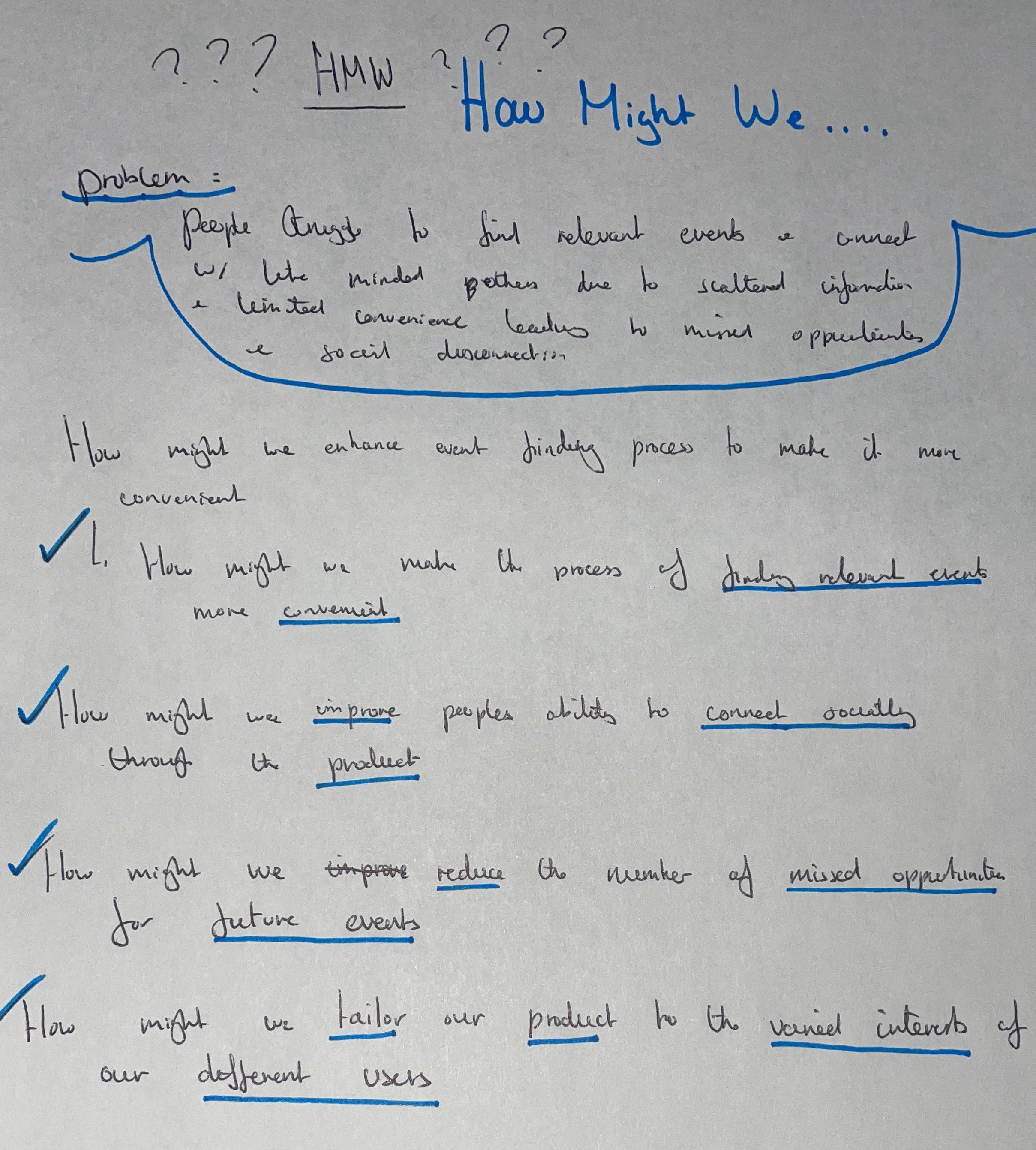
Problem Statement:
Many people struggle to find relevant events and connect with like-minded individuals due to scattered information and limited convenience, leading to missed opportunities and social disconnection.
Exploring both key and indirect competitors, I gained an insight into what direction I wanted to take Gallerio in.
Identifying strengths and weaknesses for each product, this prompted great thought for innovation within my own design and helped to establish the foundations for which Gallerio would be built.
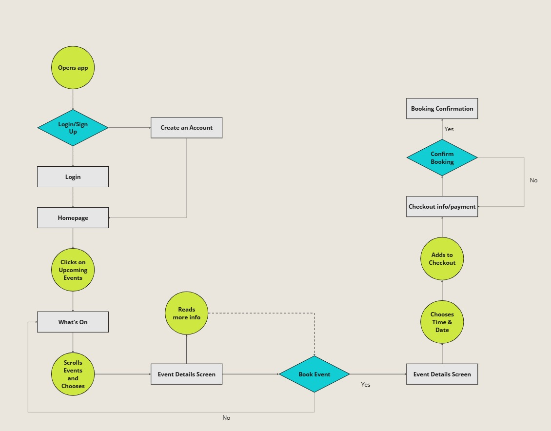
User Flow
I could then begin drafting navigation flows for my product. Considering users’ likely pain points and motivations, with the aim of optimising the users journey to make it as efficient as possible
How Might We…
Ideate
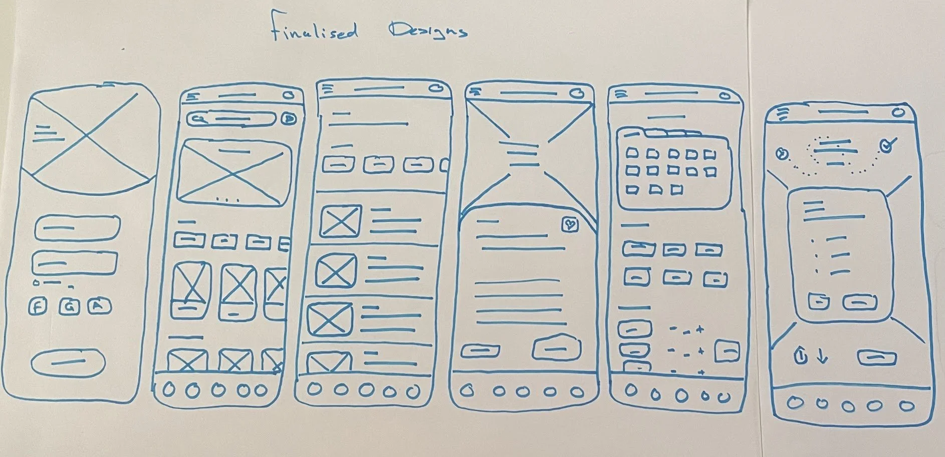
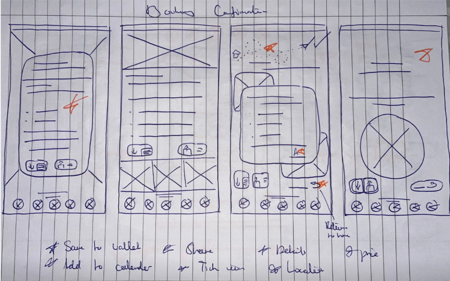
For each of the 6 screen involved in the checkout flow shown here, I carefully drafted a number of iterations.
Considering users goals and motivations, I aimed to come up with effective solutions that would benefit the user and improve their overall experience.
I could then sift through each design and select the most appropriate features/elements to include within the finalised draft; adding stars to those I wanted to keep.
Going Digital
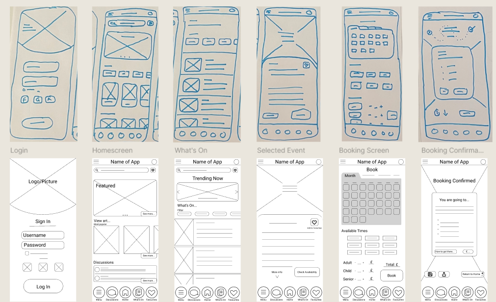
Paper Wireframes
Usability Test
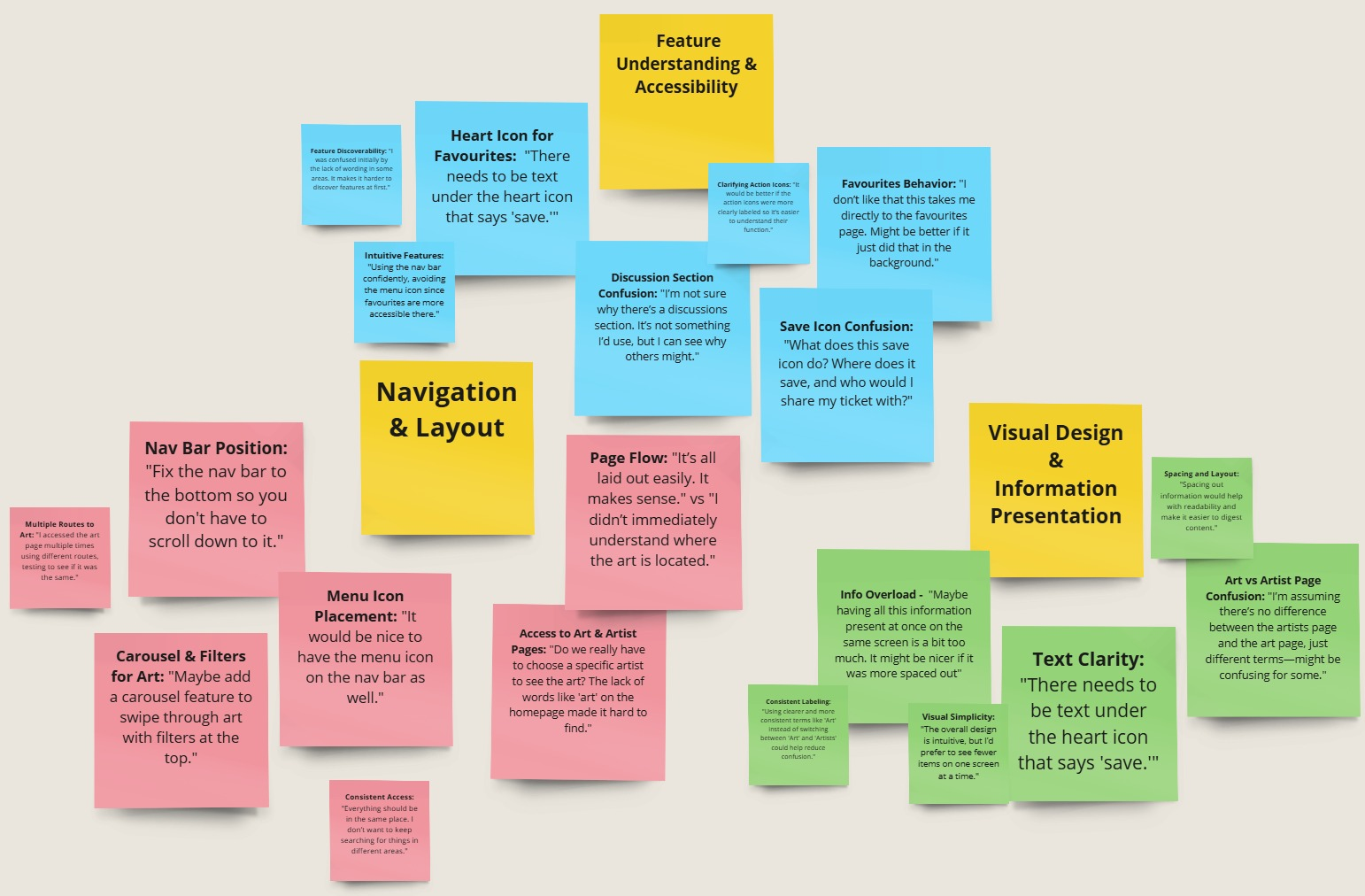
Following the development of the Lo-Fi prototype, a test was conducted on 5 participants to inform the future design process and establish initial functionality and ease of use regarding a number of the products features.
Findings
Through affinity diagrams and thematic analysis, I was able to condense the feedback into actionable insights…
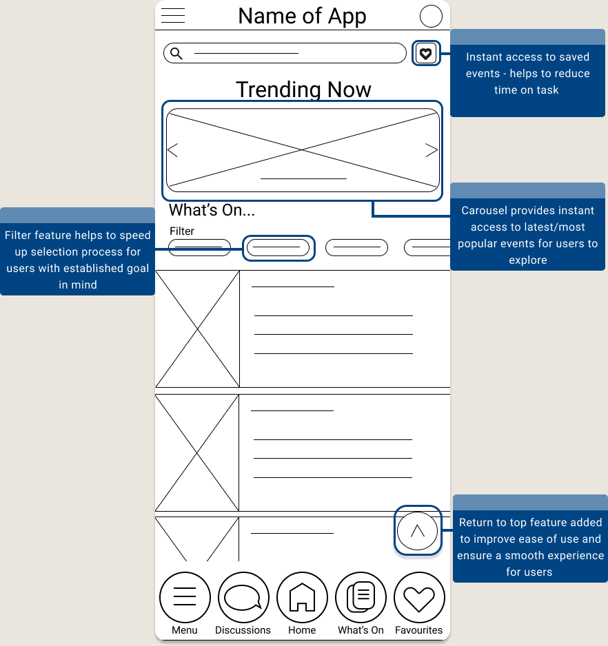
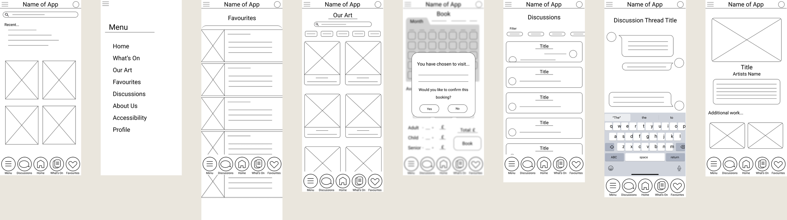
Users preferred navigating the app using the navigation bar exclusively.
Users struggled to save or favourite events.
Users wanted the ability to view all artwork at once and apply filters while exploring the art page.
Users wanted the homepage to feature an "All Art" section for easier browsing.
Recommendations
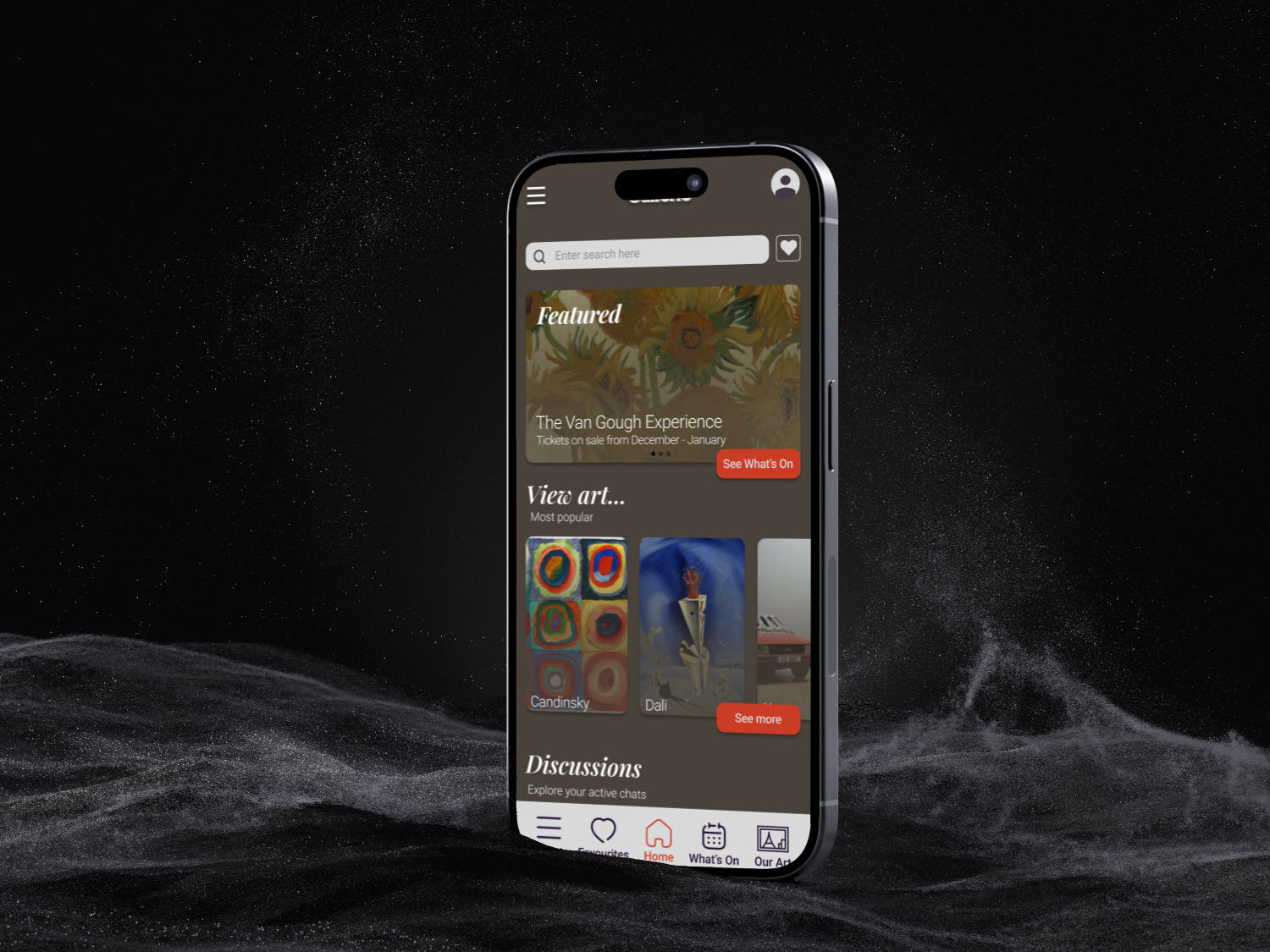
Hi-Fi Prototype
Redefining the Design
A further usability study was conducted to inform on the design, appeal, and functionality of the product in it’s more refined form.
Findings…
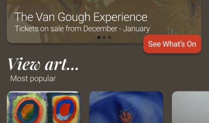
Users expressed a desire for a more prominent access point to the "Our Art" page directly from the homepage.
Users struggled to associate the featured element and the "What’s On" page.
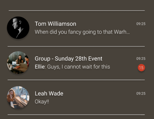
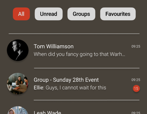
Users preferred the ability to filter discussions by group chats, individual chats, and unread messages.
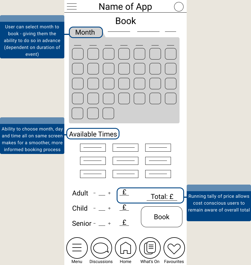
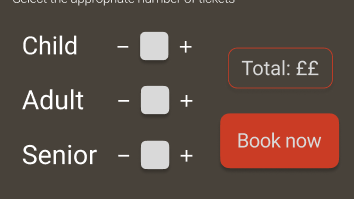
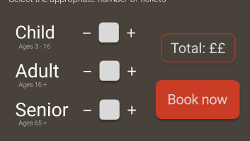
Participants suggested that age ranges should be included in the ticket selection process to reduce confusion around defining categories like child, adult, and senior.
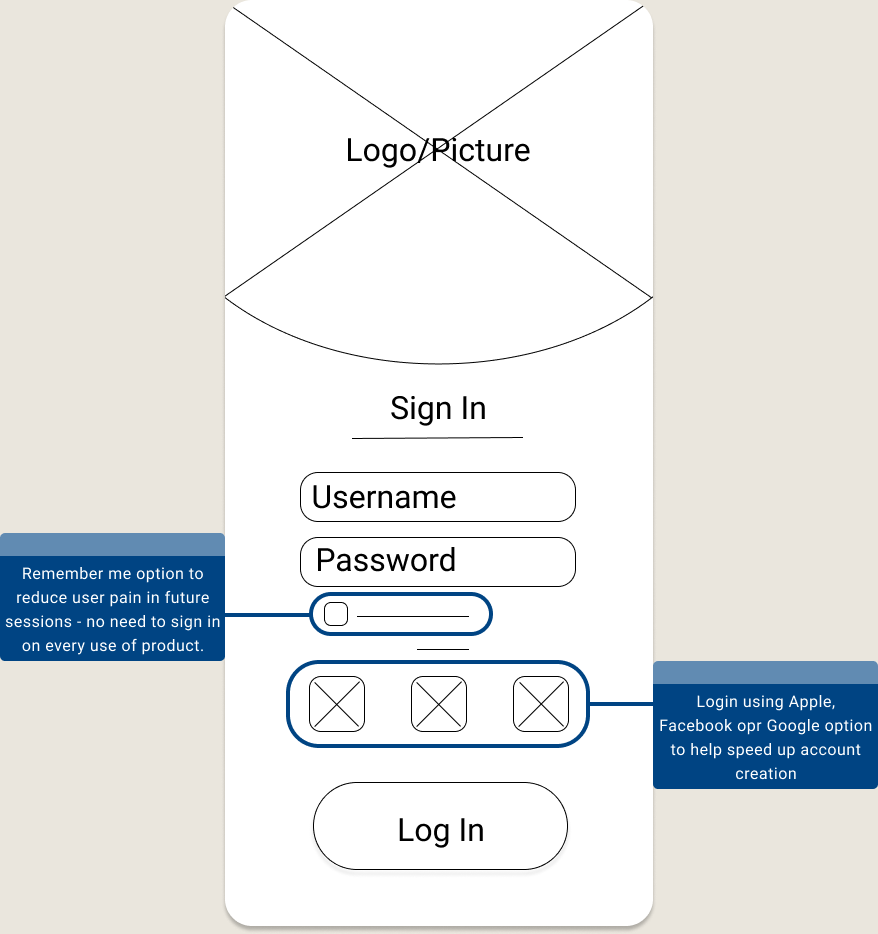
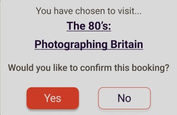
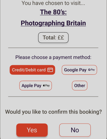
Some expressed concern about the lack of a payment method in the booking process.
Users struggled to connect the "Featured" element with the "What's On" page, so I changed the CTA text to "See What's On" and made the page titles interactive to improve navigation.
Users' displayed a preference for filtering discussions by group chats, individual chats, and unread messages; here, I added a filter option at the top of the screen and adjusted the page layout for better appeal.
Participants suggested to include age ranges in the ticket selection process to clarify the categories of child, adult, and senior. I later added this information underneath the original ticket category.
Some participants expressed concern about the absence of a payment method in the booking process. Consequently, I included a section in the booking confirmation screen with the total cost and payment method options.
Test
Move the menu icon to the nav bar and remove it from the top of the page.
Add a section above the artist listings to showcase all available art from the gallery.
Incorporate a set of filters that can be applied to the displayed art.
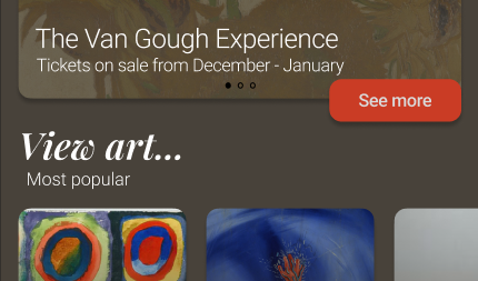
Include a "View Art" button on the homepage for easier access.
Place the text "Add to Favourites" beneath the heart icon for clearer functionality.
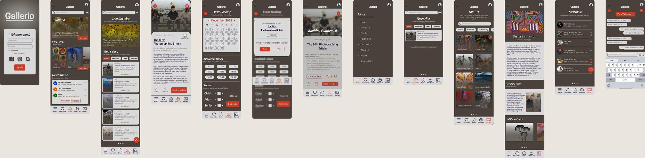
Improved Design

How might we make the process of finding relevant events more convenient for the user?
How might we improve people’s ability to connect socially through the product?
How might we reduce the number of missed opportunities for future events?
How might we tailor our product to the varied interests of our different users?
Hi-Fi Prototype
Takeaways
Learning and growth is important. This project really helped to teach me each step of the design thinking process. I have gained valuable insight into both user research and user experience design which has proven invaluable to my development as a user experience designer. I look forward to taking this experience with me onto my new project.