CareCo
Optimising the UK’s leading mobility specialists e-commerce experience
Junior UX Designer
Overview
As a junior UX designer at CareCo, I finally found myself immersed in a world I had longed to be part of — absorbing knowledge from those around me and gradually taking on greater responsibility. In my first year, I worked on new page creations, A/B testing, user research, page building and more, with my skills and industry knowledge growing every day.
The learning curve
Beginning as a junior designer, I came from a background of voluntary and personal projects. This role quickly immersed me in working alongside industry professionals, presenting my work and rationale to the CEO and senior stakeholders, all while focusing on creating compelling, high-performing designs aimed at driving conversion, increasing sales, and achieving key KPIs within the ecommerce mobility industry.
Objectives
I focussed on expanding my skillset as greatly as possible, taking on as many additional assignments and training oppurtunities as I could to build an arsenal of design skills and knowledge that would benefit me as I went on. Tasked with page designs, asset creation, user research and CRO, I quickly adapted to the role of a user experience designer.
Personal development
With continued development in industry-standard tools such as Figma and the Adobe Suite, I later expanded into conversion rate optimisation and A/B testing. Using analytics platforms like Microsoft Clarity to conduct user research, I went on to build effective A/B tests focused on improving overall site usability and driving conversion growth through tools such as VWO and AB Tasty.
The Project:
Showcasing the Brand
About us page
The home of the brand and what people from all backgrounds would visit when coming to the site to learn more about CareCo.
Potential customers, clients, partners, prospective employees etc., would all be visiting this page to learn more about the company, who we are, what we stand for and what the company represents. This page was more than just showcasing the stock we offer and our fancy showrooms, it encapsulates the entire ethos of the company and acts as the hub for public perception.
Key principles involved
User-centred design: Aligning the page’s tone and messaging with the needs and expectations of the target audience.
Stakeholder collaboration: Gathering insights from cross-functional teams to understand brand goals and user needs.
Beginning with an understanding
Going into this project, I had a few big questions—mainly, who were we actually talking to? I needed to figure out if we were aiming for a corporate feel or something more public-facing, as that would drive every choice from the copy to the visuals.
Holding an initial brainstorming meeting with the CEO, the leads from marketing, branding, and design and our social media lead, we were able to share our collective thoughts on the style, vision and goals for this page. This initial meeting gave me a solid definition of how to proceed - keeping the brand at the very core of each decision I was to make moving forwards and focussing on a customer orientated approach to the page - I then had the creative freedom to move forwards on my own.
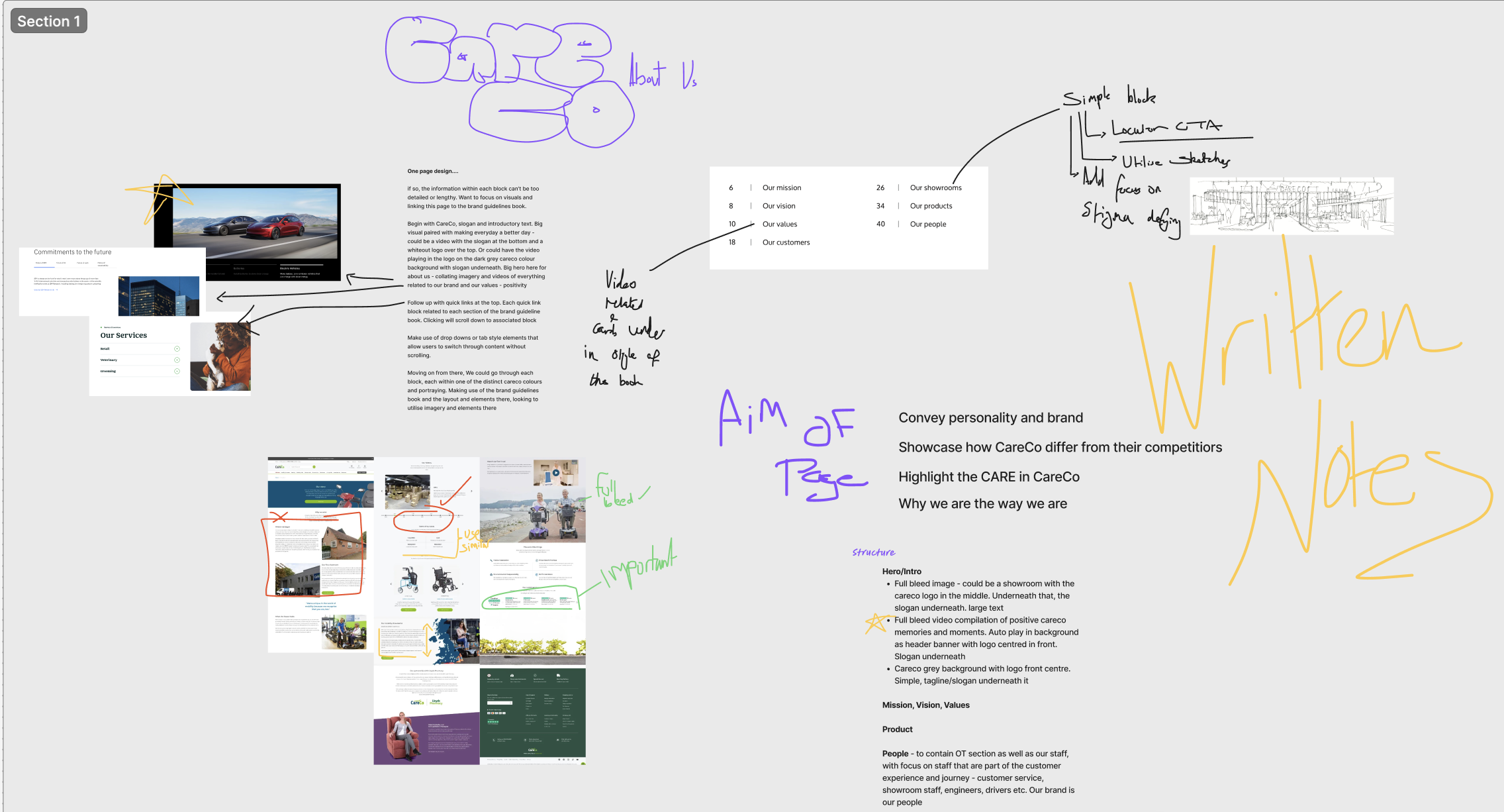
Moving forwards with purpose
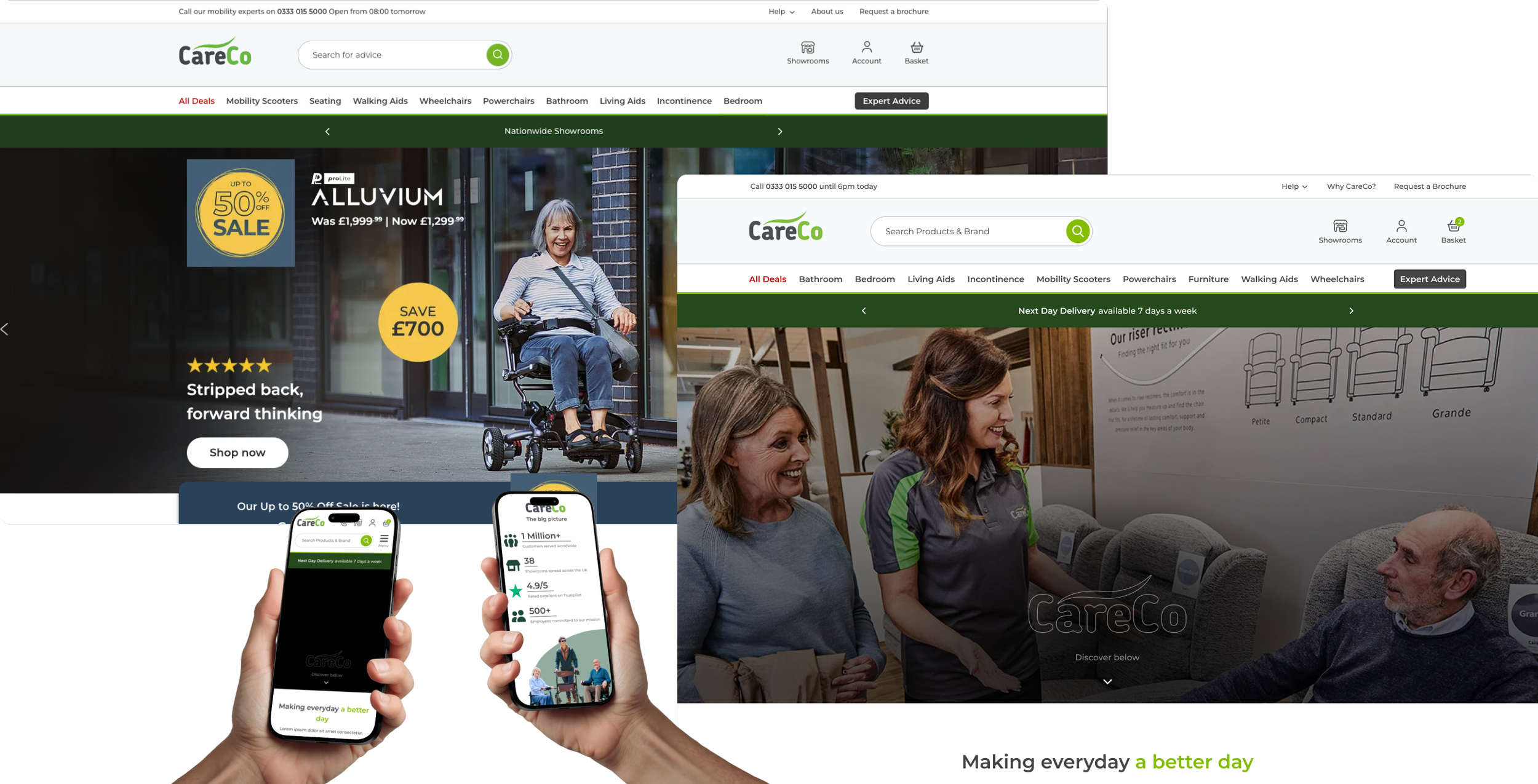
With the vision and audience set, I kicked things off by auditing our current About Us page, and it didn't take long to see it needed a total revamp.
The old imagery and walls of text felt messy and overwhelming, and between the endless page length and a visual clutter, I knew there was a massive opportunity for a redesign that actually focused on accessibility and a better user experience.
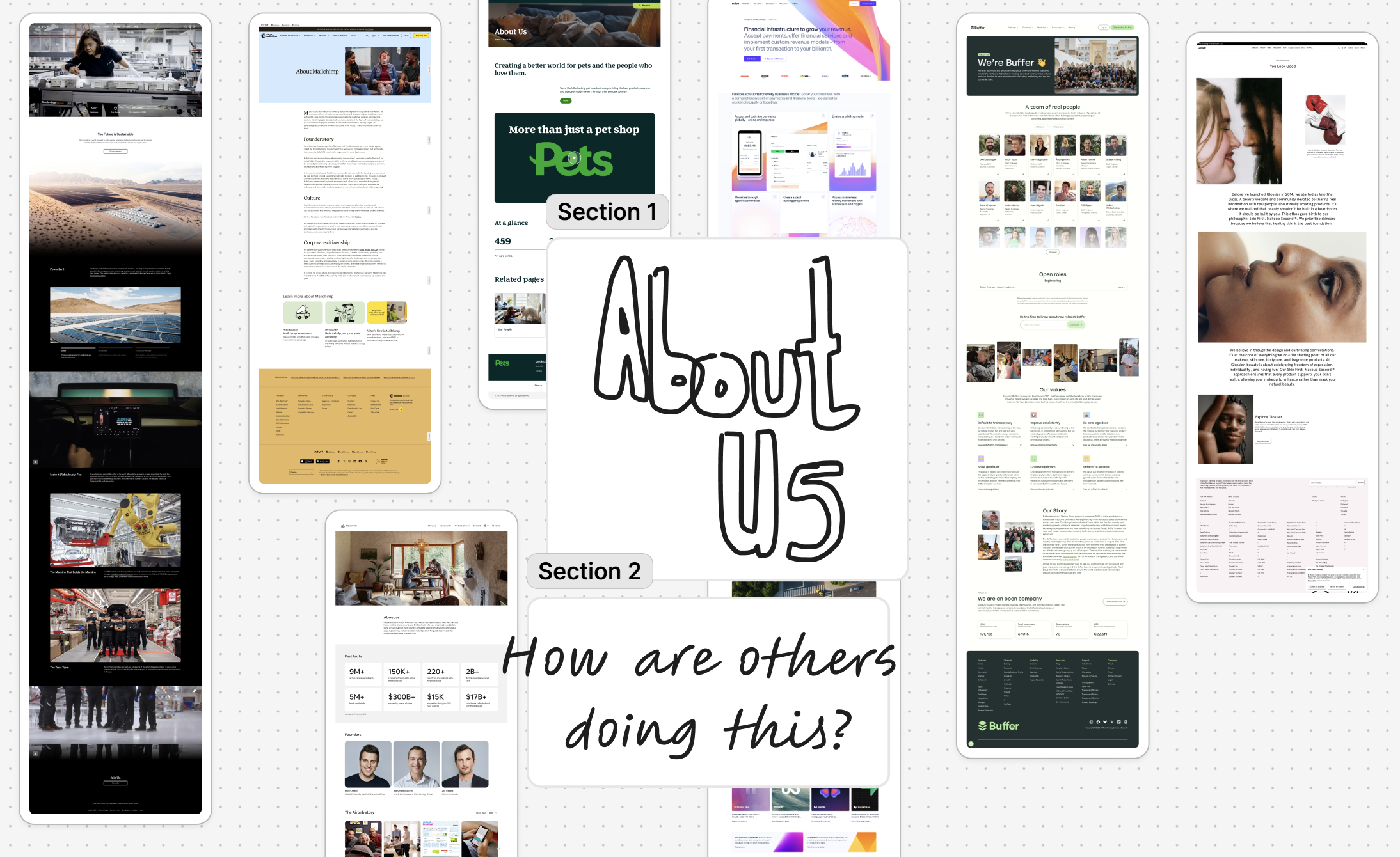
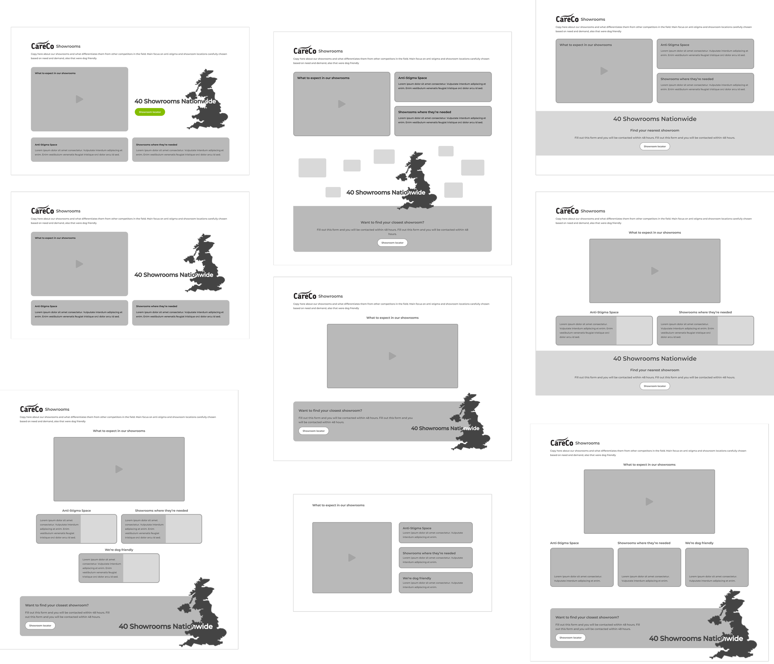
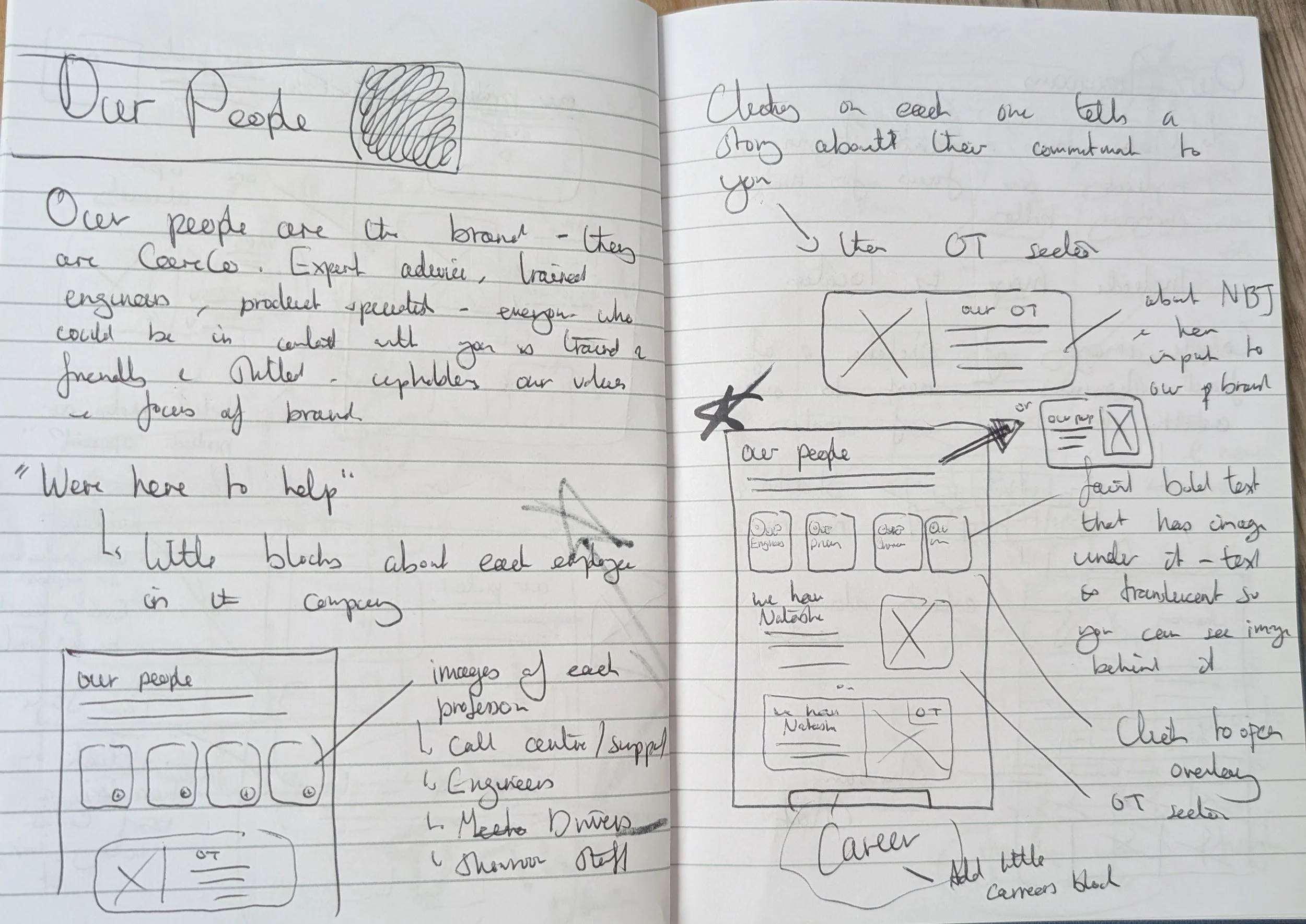
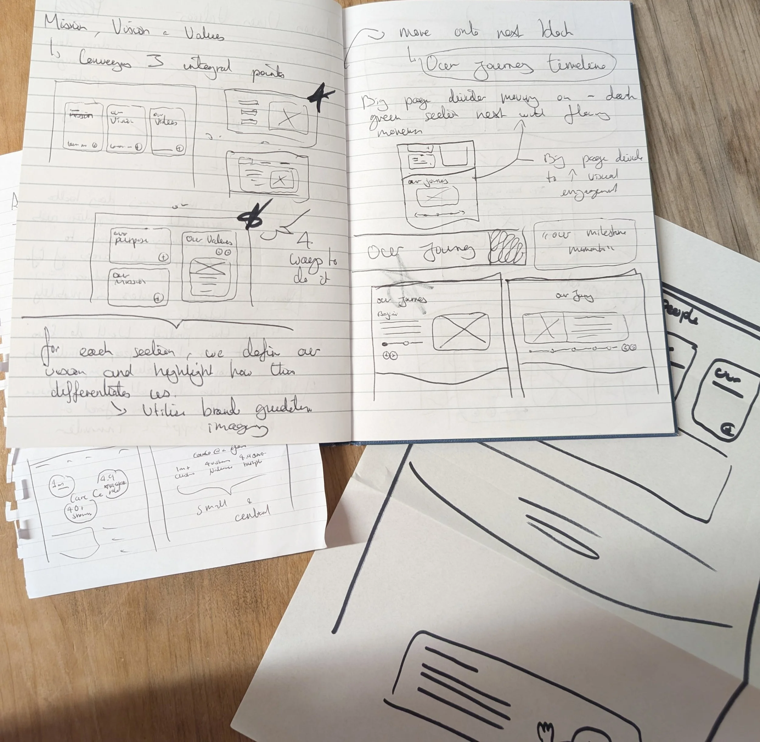
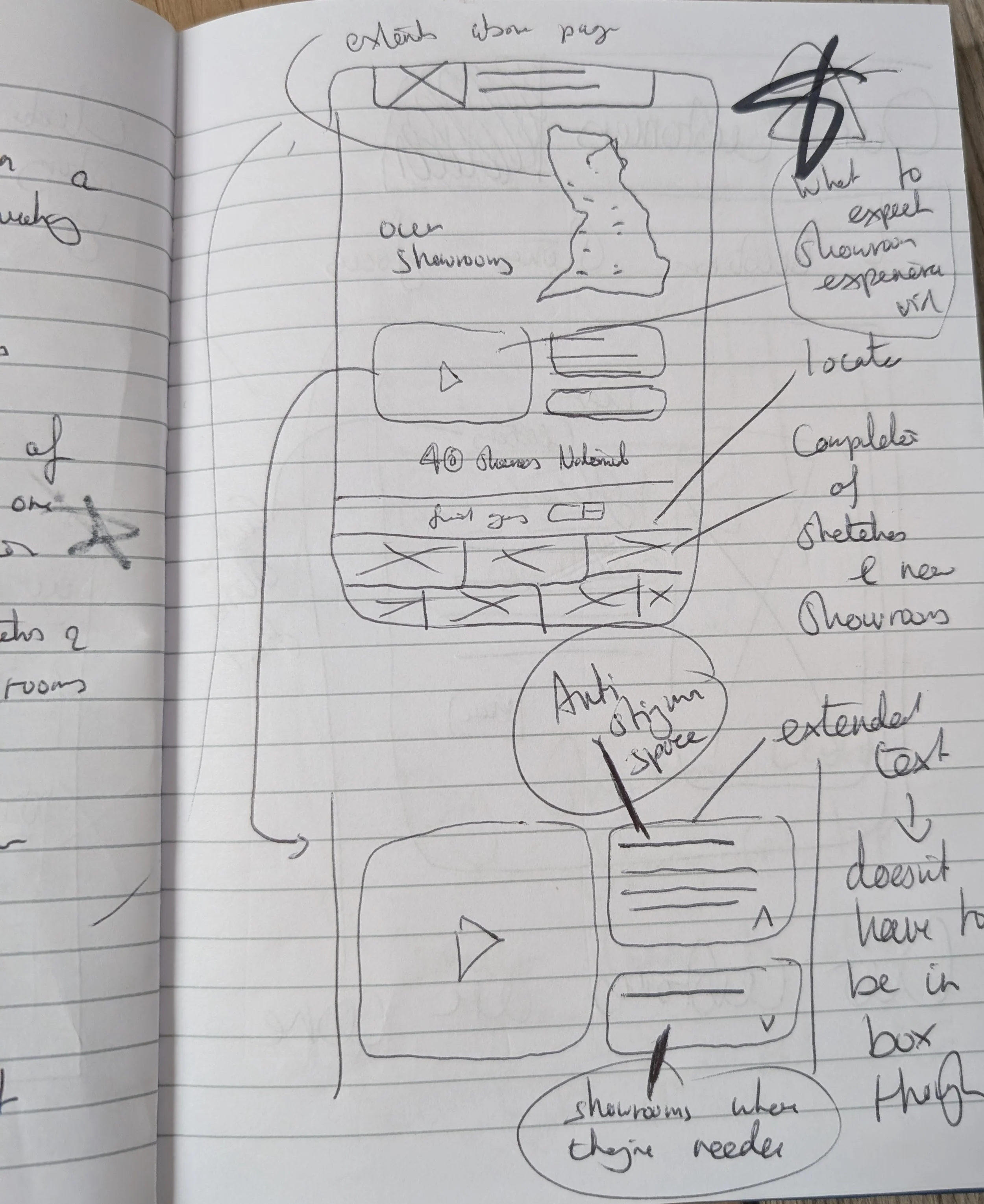
After marking up the old page, I checked out some big e-commerce competitors to see how they handled their storytelling, which gave me a solid framework to work with. This allowed me to use our CareCo brand book to map out a new content hierarchy, breaking the page down into five clear, digestible chapters: our mission and values, showrooms, products, customers, and our team.
Key principles involved
Information architecture: Structuring content into clear sections to improve readability and navigation.
Accessibility & cognitive load reduction: Simplifying dense content and visual clutter to create a clearer, more digestible experience.
Drafting out the vision
Key principles involved
Mobile Prioritisation
Prioritising layouts that work effectively on smaller screens where analytics report +70% of our users are.
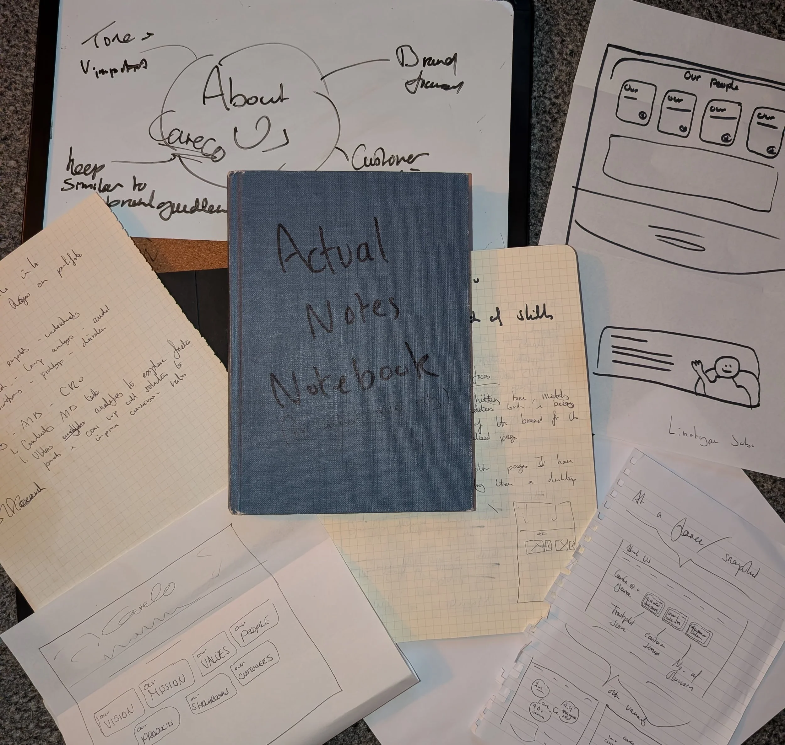
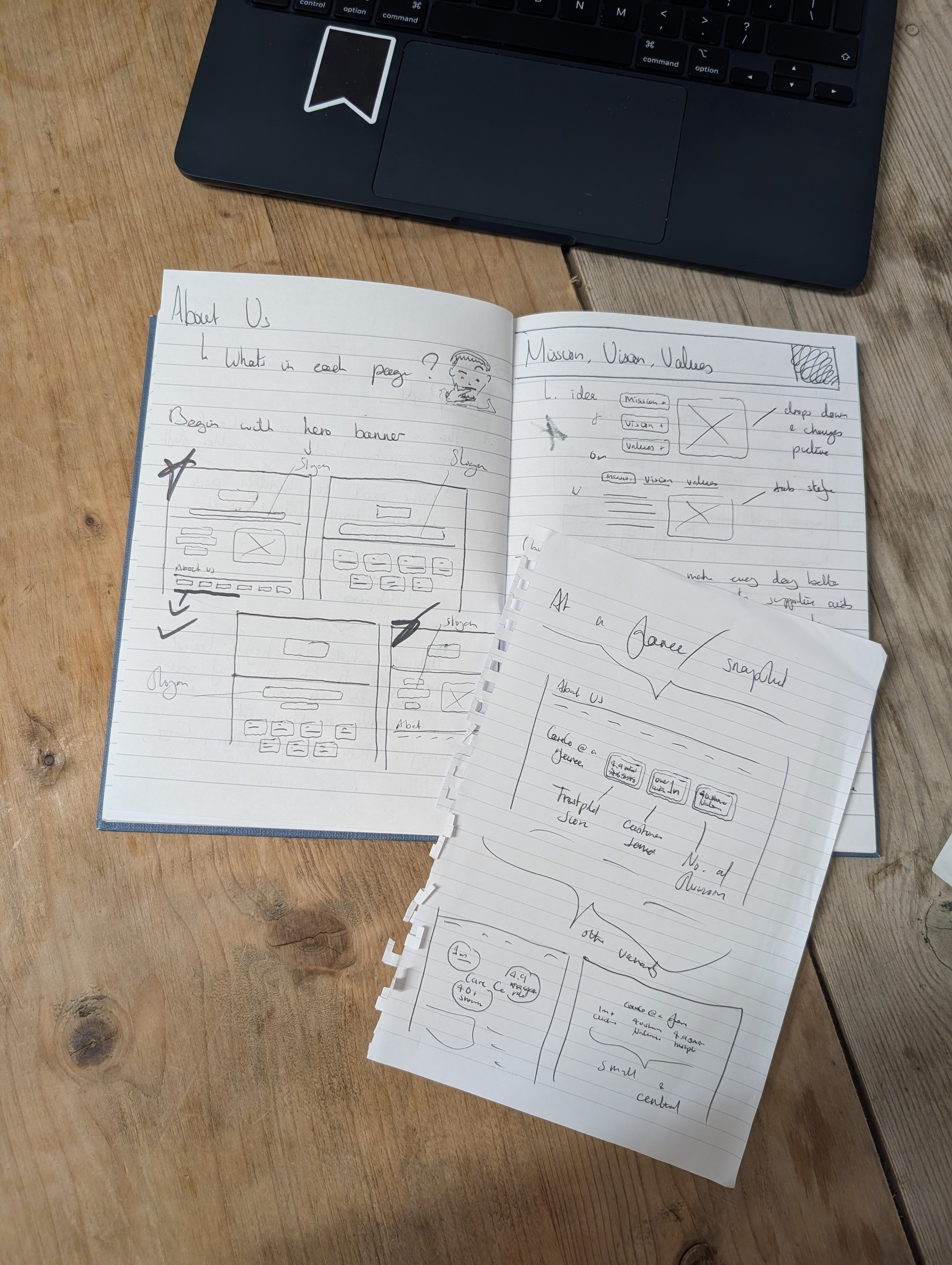
Rapid Ideation
Exploring multiple layout concepts through sketches and lo-fi wireframes before committing to a final direction.
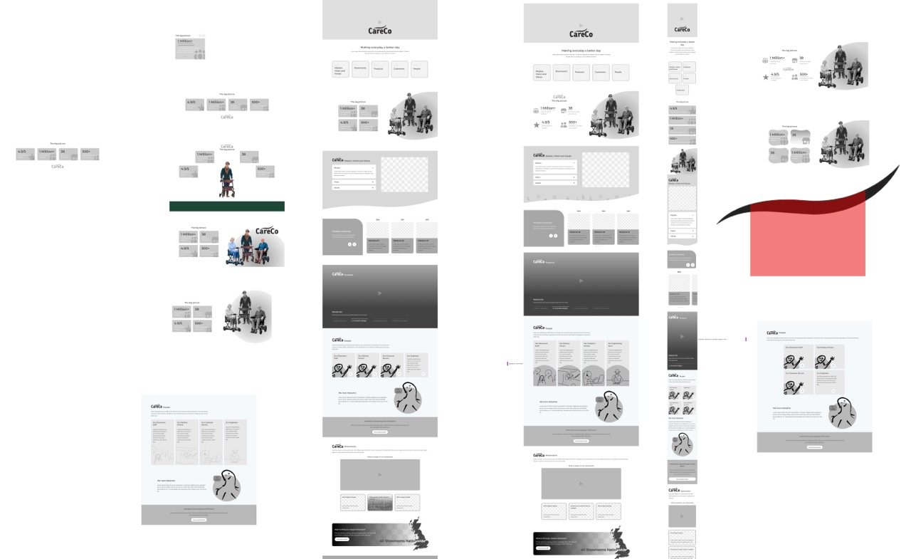
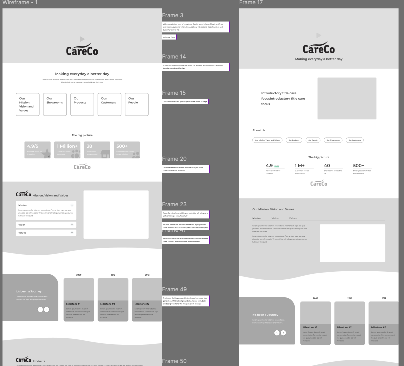
With a clear understanding of the structure, audience, and tone, I moved into the initial design phase. Working top to bottom, I drafted multiple iterations of the hero banner and five content blocks, sketching first to explore the most effective layouts.
My goal was to keep everything succinct for both desktop and mobile—especially with 70% of traffic coming from phones. I designed each block to fit neatly within the viewport to reduce scrolling, while keeping the CareCo brand at the heart of the page with warm, person-centred imagery.
I then moved into lo-fi wireframes, continuing to refine layouts and optimise the overall flow of the page.
Midway Meetings
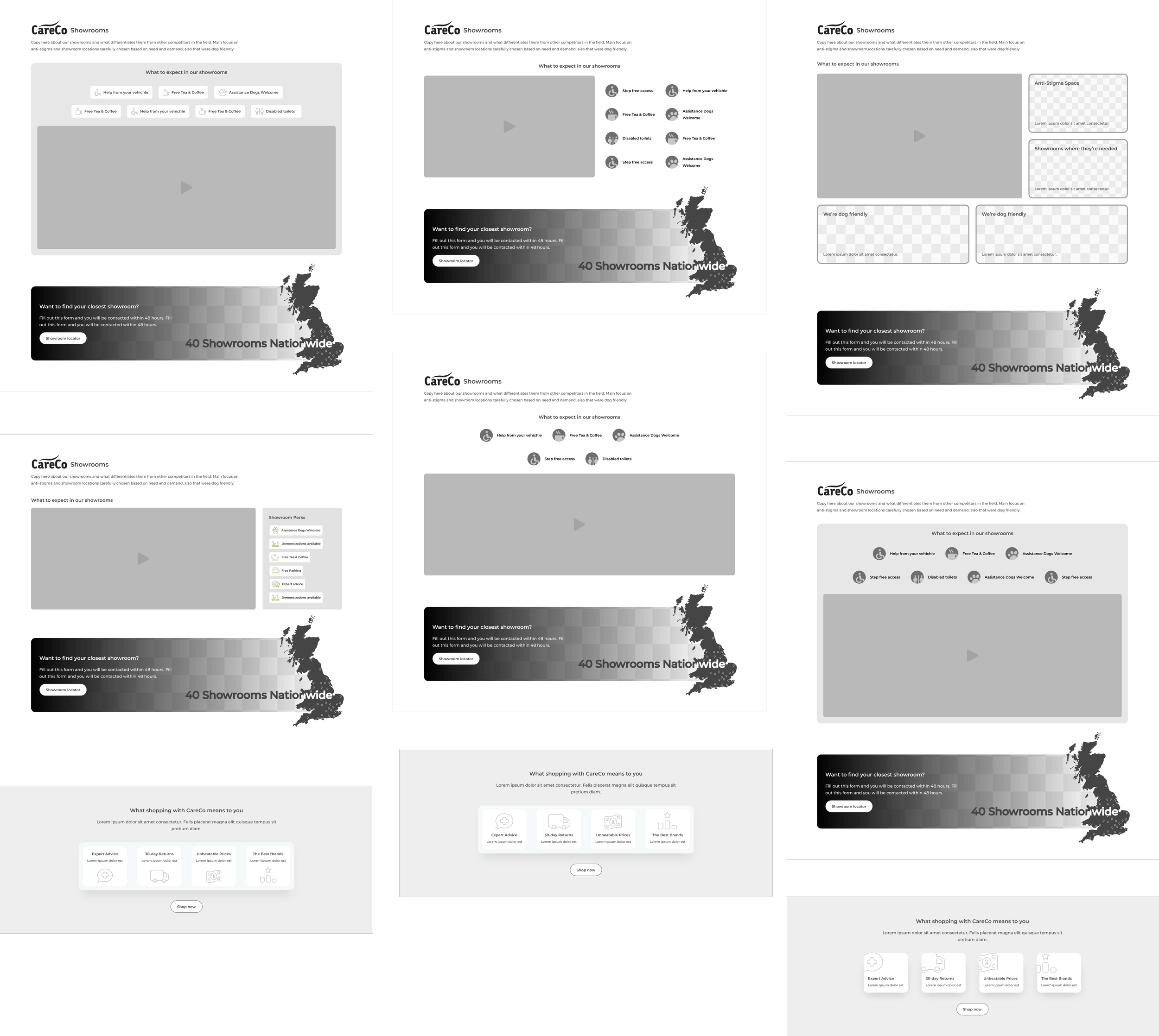
Having regular design catchups with my manager and other digital designers gave me the opportunity to share my designs at multiple stages across the process.
Presenting my ideas and rationale opened up the ability to receive constructive feedback and create further iterations to the page - further optimising the layout and designs. See the changes here from initial mockup to present design.
Key principles involved
Iterative designs - Refining layouts through continuous testing, feedback, and improvement cycles.
Rationale Presentation - Building confidence in presenting designs, ideas and rationale to major stakeholders.
Laying the grounds for finishing touches
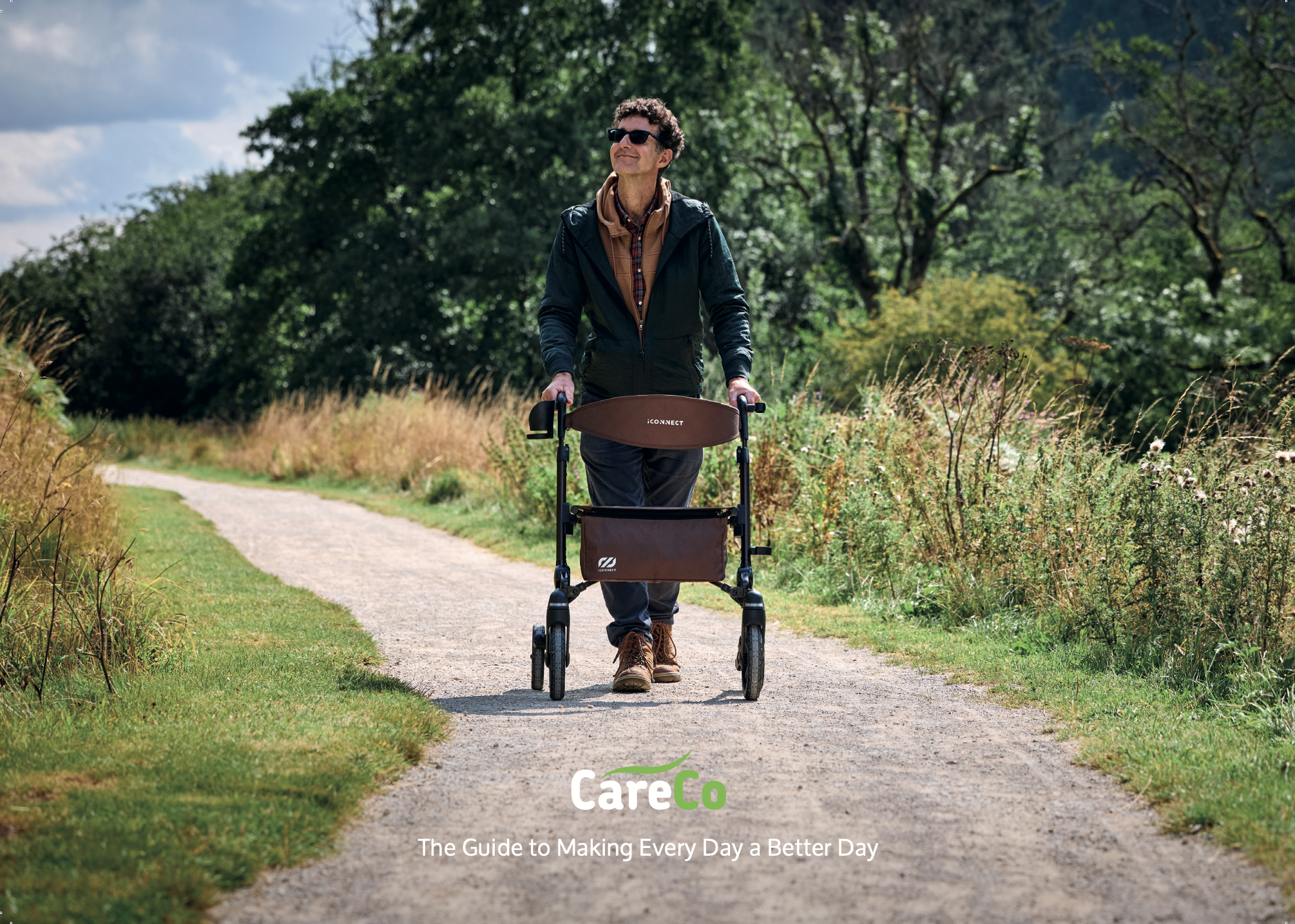
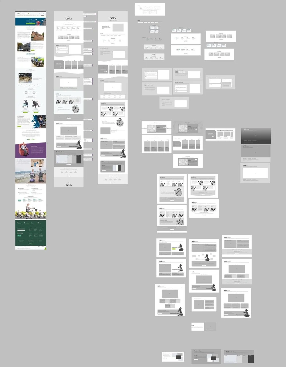
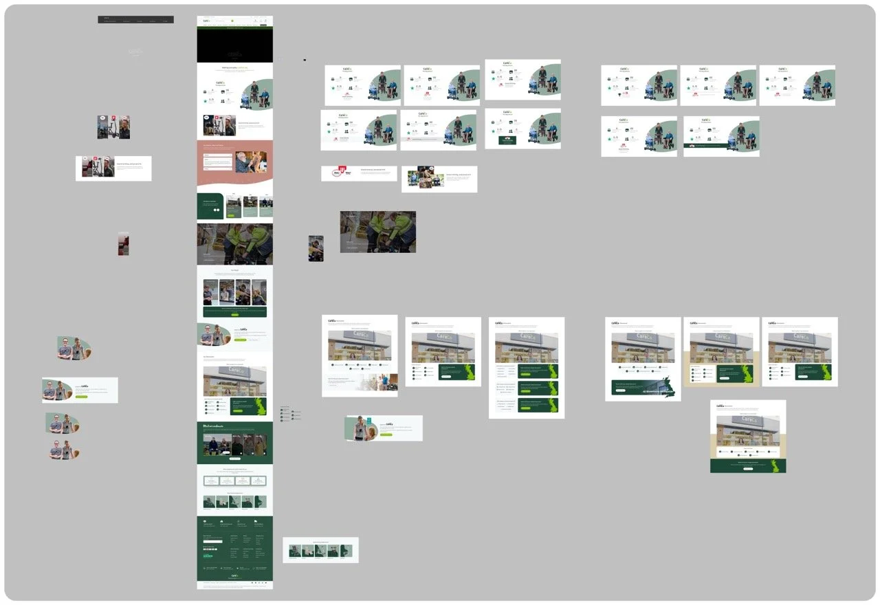
As I neared the end of the first phase, I moved into a hi-fi prototype, selecting imagery and colours that showcased every part of the CareCo brand—from the warehouse and engineers to showroom advisors and the corporate team. Presenting this to the CEO and Head of Marketing led to valuable feedback, reinforcing the importance of “personifying” the brand. This guided later iterations, including redesigning the people section to highlight individual employees and strengthen that human touch.
With those insights, the content, structure, and overall tone finally felt right. After a few final tweaks based on feedback, I wrapped up the design phase and delivered the final desktop and mobile versions ready for development.
Key principles involved
High-fidelity prototyping: Creating realistic representations of the final product to test design, content, and brand tone.
Human-centred storytelling: Using imagery and real people to create emotional connection and strengthen brand authenticity.
To wrap things up, the final designs were signed off by senior designers and stakeholders, allowing the project to move into the build phase. Developers then began creating bespoke sections to bring the page to life.
That’s all folks!
UX Research
Conversion Rate Optimisation and A/B Testing
Hypothesis
The idea was pretty simple: if we show users how popular a product is, this should instill trust and confidence in the product itself and users will be more likely to buy it. I wanted to test if adding a small "social proof" note—like "80 people have viewed this today"—to the product gallery would give shoppers that extra bit of confidence. The goal was to see if highlighting demand would make the products feel more desirable and help push people toward a sale.
Preliminary Research
While exploring CRO at CareCo, I noticed big e-commerce sites use subtle nudges to build trust—something our site was missing. I wanted to see if these small, smart tweaks could drive revenue and make the shopping experience feel more dynamic and active.
Test Parameters
I set up the experiment using A/B Tasty as a 50/50 split. Amongst the three products that were chosen, one was a popular bestseller, one was struggling to hit its targets, and one was a brand-new product. I let the test run until we had enough visitors for the data to be solid, which helped me see exactly which type of product benefited the most from the change.
Control Condition
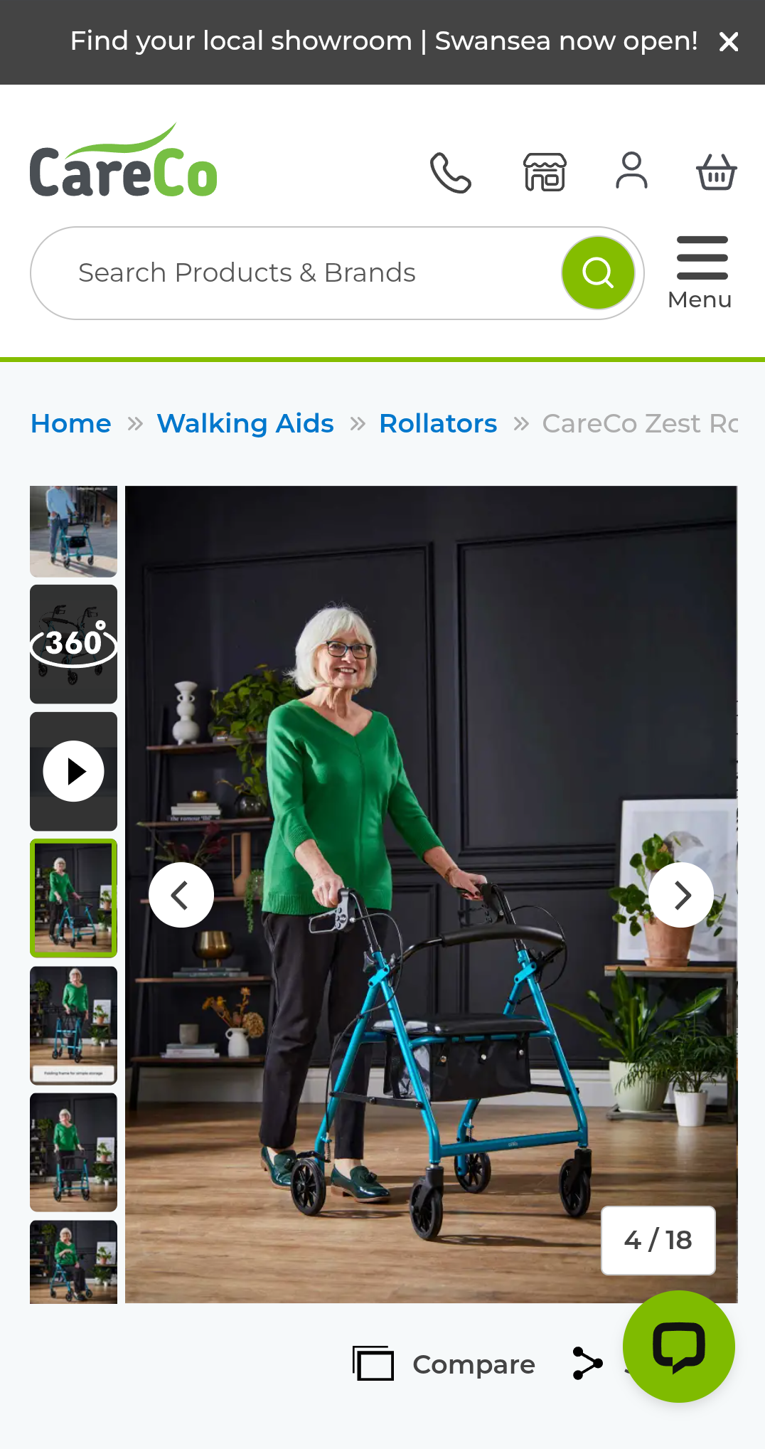
Control condition simply contains the images within the photo library along with product information and Add to basket CTA below
Test Condition
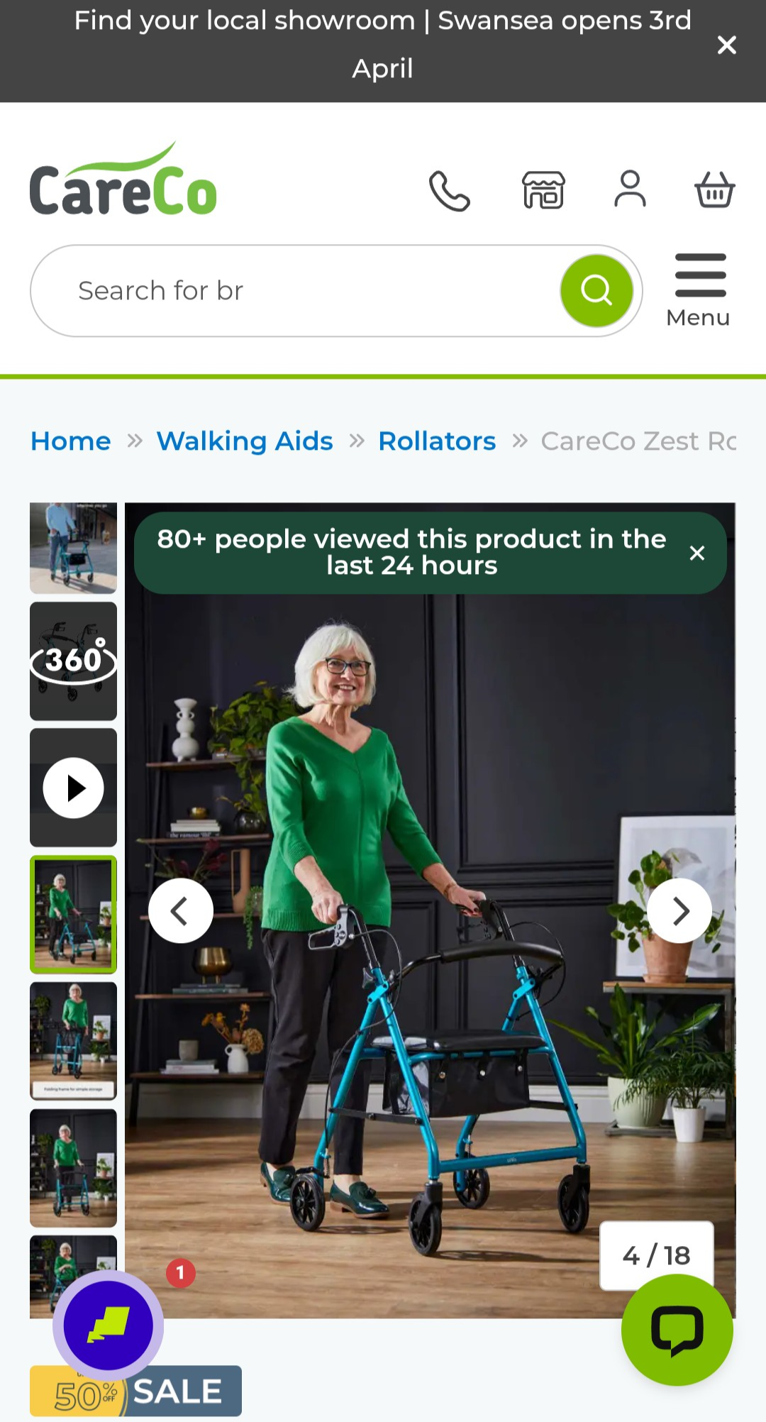
Test condition has the added social proofing at the top of the image on the photo library showcasing its popularity amongst users
Results
The data showed a clear win: the social proof messaging boosted both conversions and revenue across the board.
Interestingly, the biggest impact wasn't on our bestsellers, but on the underperforming products. It turns out that while social proof is a great tool overall, it’s most effective at giving struggling items the extra "push" and credibility they need to get over the finish line.
Which is where we plan to utilise this the most moving forwards
What’s Next?
Following the positive results, we’re looking into a wider rollout. The next phase is to experiment with the messaging itself—moving from subtle view counts to more urgent triggers like sales volume ("10 sold today") or interest levels (“15 added to basket today“). The goal is to see how different tones affect purchasing behavior while ensuring we don't become too pushy and lose user trust.