East London Waterworks Project
From Concrete Depot to Community Oasis
Volunteer - Freelance User Experience Designer
Overview
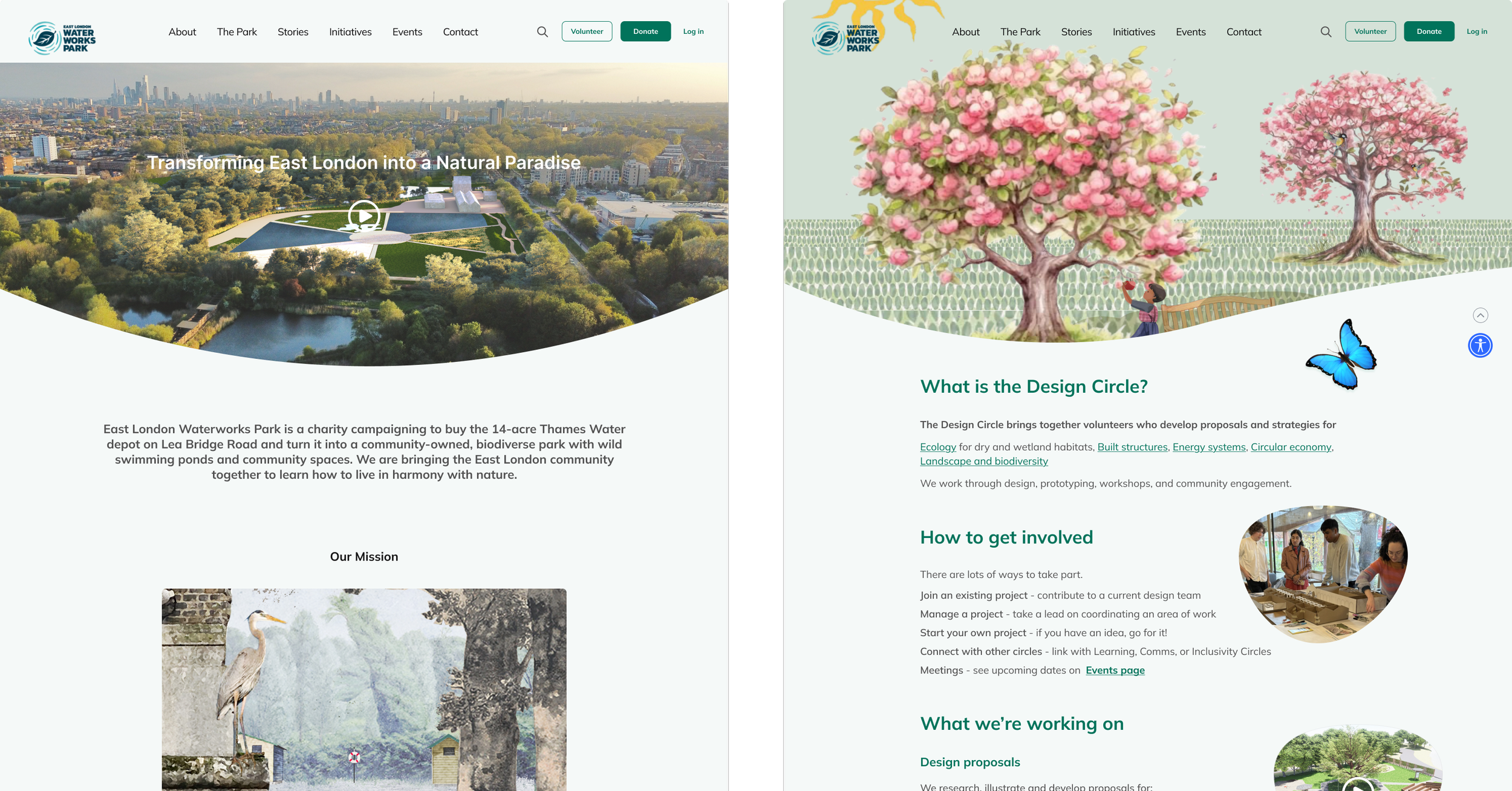
A community-led project transforming a 14-acre industrial depot into a "brownfield rainforest." It features the UK’s first community-owned swimming ponds and biodiverse spaces designed to reconnect East Londoners with nature.

Problem
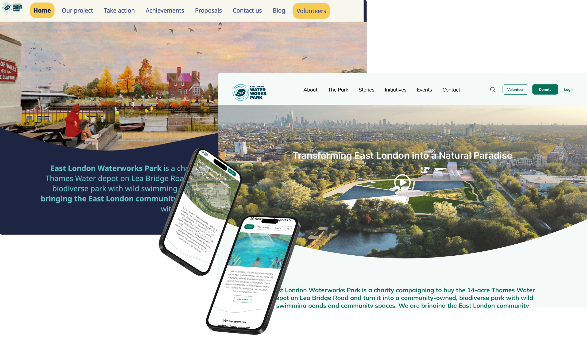
The original site was an "information dump" where vital details—like how to donate or join—were buried in messy navigation. The outdated interface felt disconnected and made it difficult for the community to engage.
Objective
Our goal was to rebuild ELWP’s digital presence to match its eco-conscious spirit. We focused on streamlining navigation and creating a welcoming community space that turns curious visitors into active volunteers.
Solution
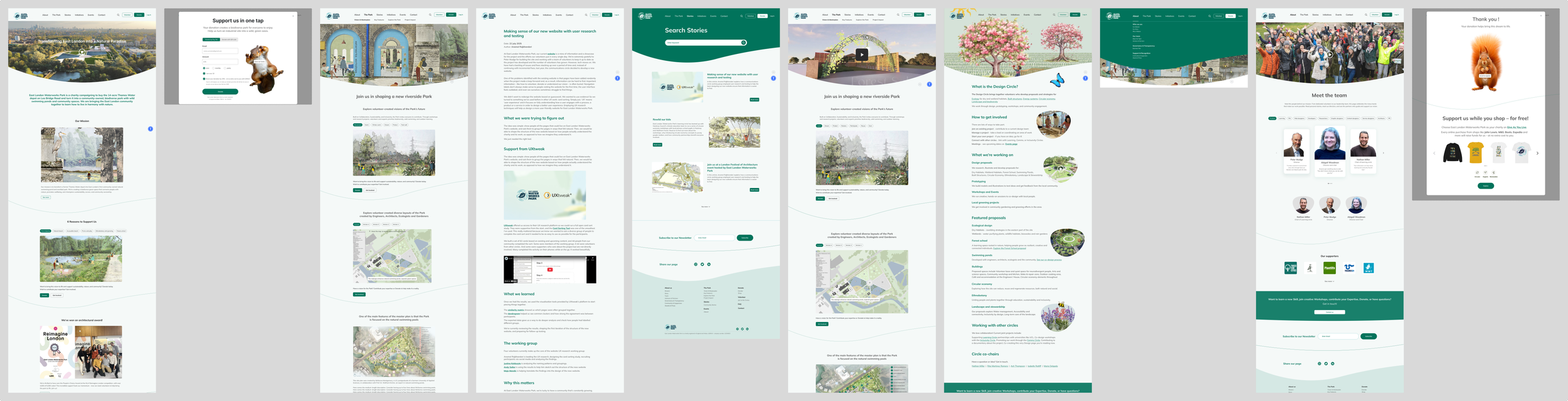
We delivered a user-centric redesign powered by community research, led with real UX focus. By launching a clean, earthy design system with a clear hierarchy, we turned a cluttered site into an intuitive, high-engagement platform.
Key principles involved
User Empathy – Getting into the headspace of volunteers and locals to build a digital home that actually feels welcoming.
Accessibility Audit – Checking colour contrast and readability to ensure everyone can join the splash, regardless of ability.
Diving into the deep end
We started by getting our feet wet with the community!
I began by diving head first into team discussions to soak up the East London Waterworks Park (ELWP) mission—turning an old depot into the UK’s first community-owned swimming ponds.
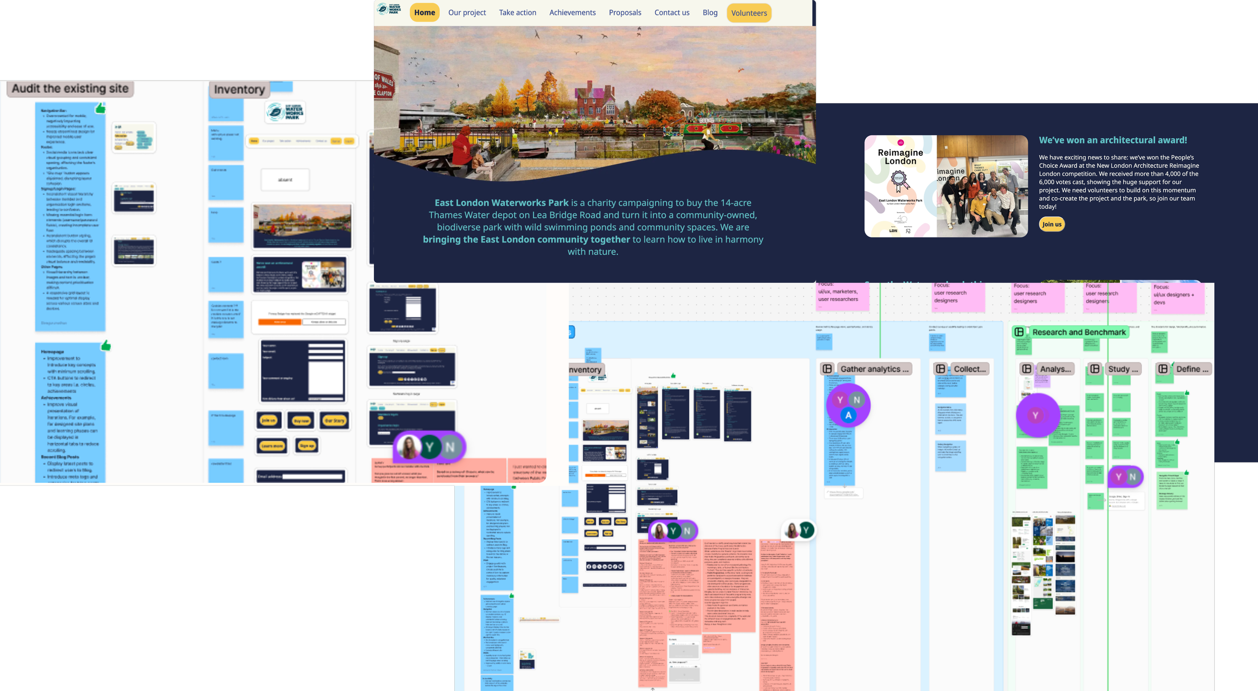
To really understand our swimmers, supporters and stakeholders, the initial plan was to audit the original site, hunting down confusing journeys and accessibility gaps that left users feeling stranded.
Navigating the Waters
Once we gathered our insights, it was time to define a clear direction.
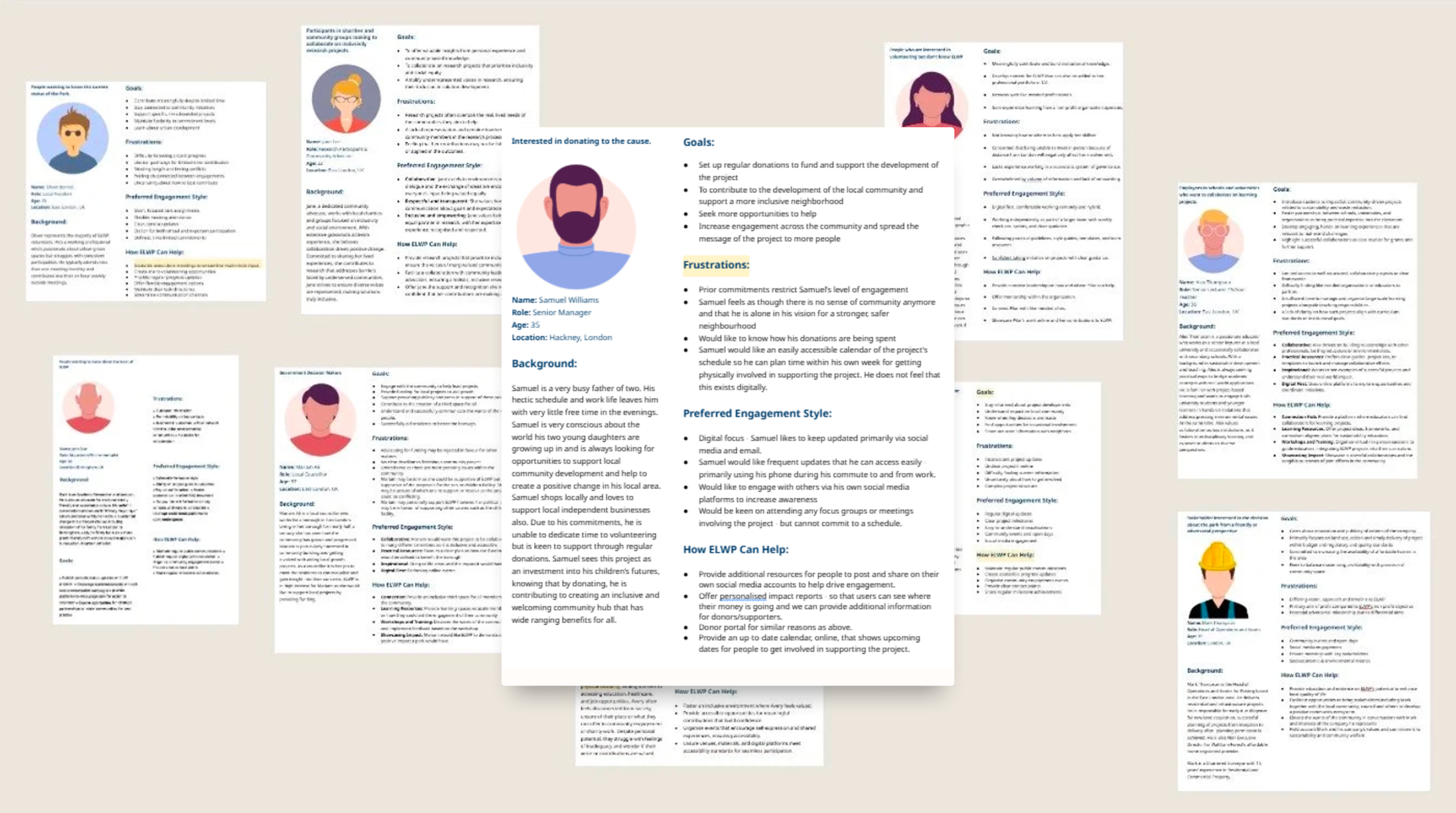
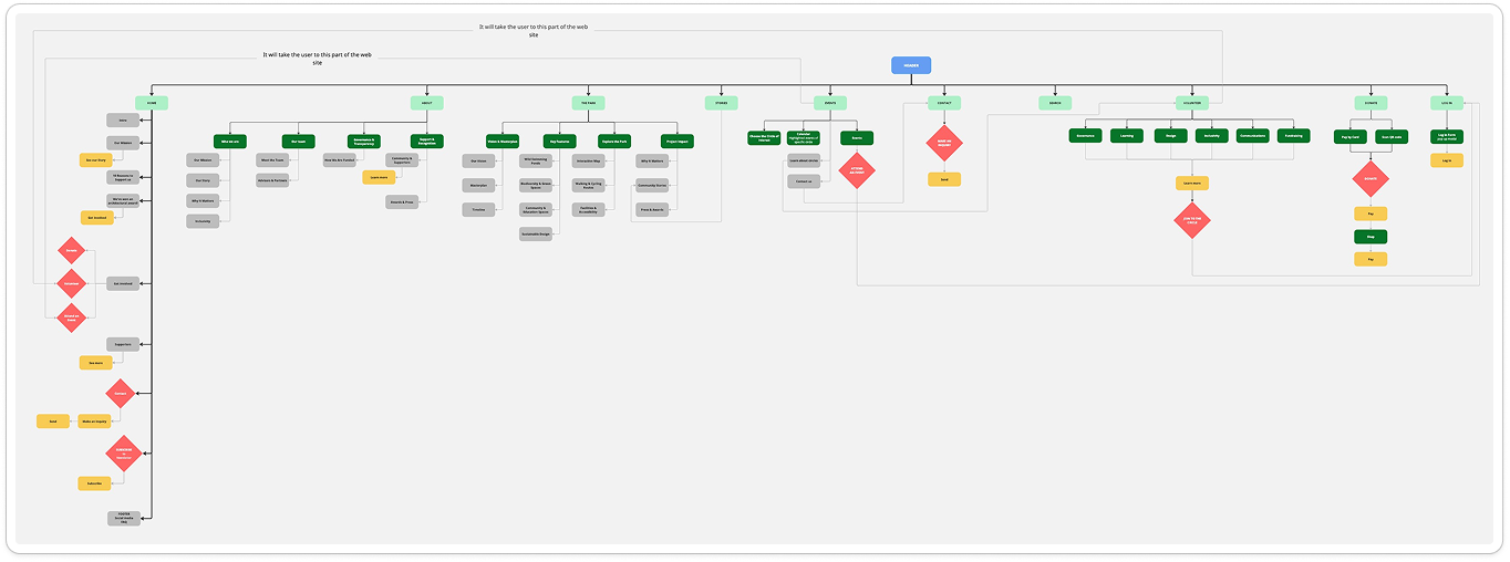
We didn’t just want a “pretty” site; we wanted one that was genuinely useful. We developed 11 diverse user personas — from dedicated local volunteers to curious first-timers — to ensure every design decision was made with a real person in mind. We also got to work on our sitemap through user journey mapping and assessing the existing information architecture
This helped us clarify our core goal: increasing volunteer sign-ups and helping the community feel a true sense of ownership and connection.
Key principles involved
Persona Hypothesis – Creating detailed character profiles to keep our design decisions anchored in real-world human needs.
Information Architecture – Mapping out the site’s hierarchy to turn a tangled web of pages into a smooth, logical flow.
Designing, thinking & collaborating
Key principles involved
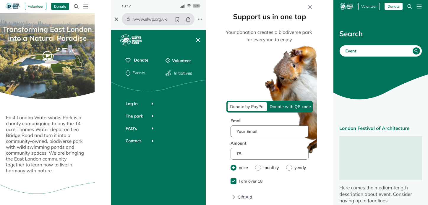
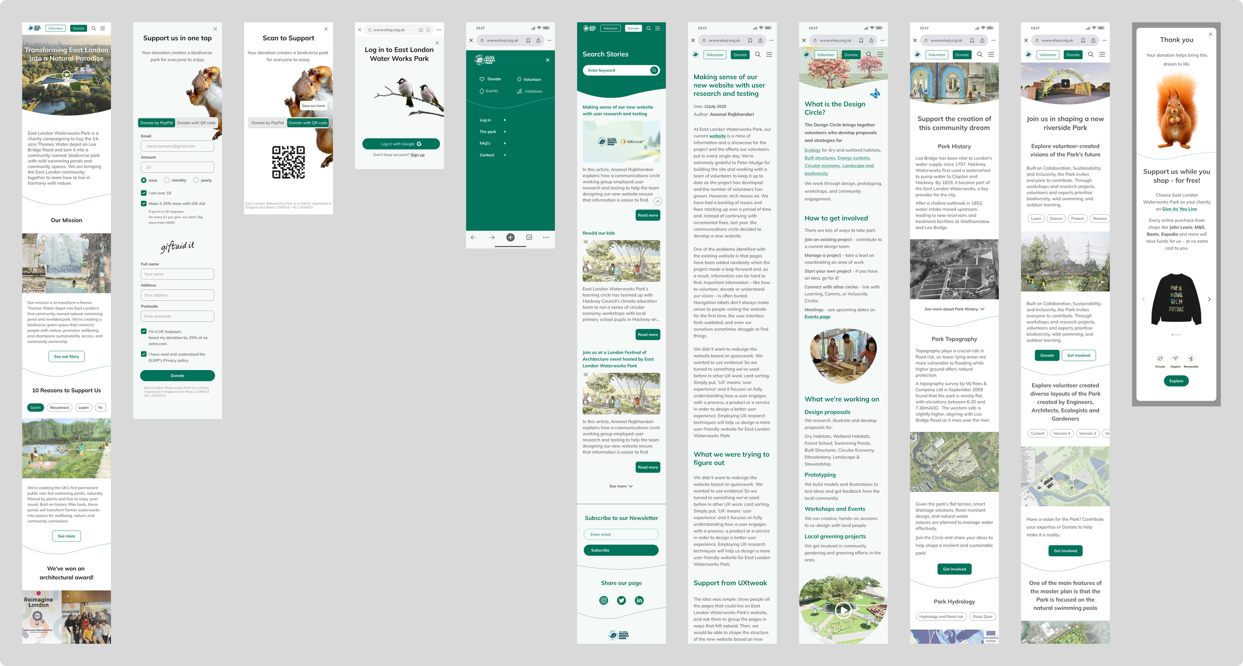
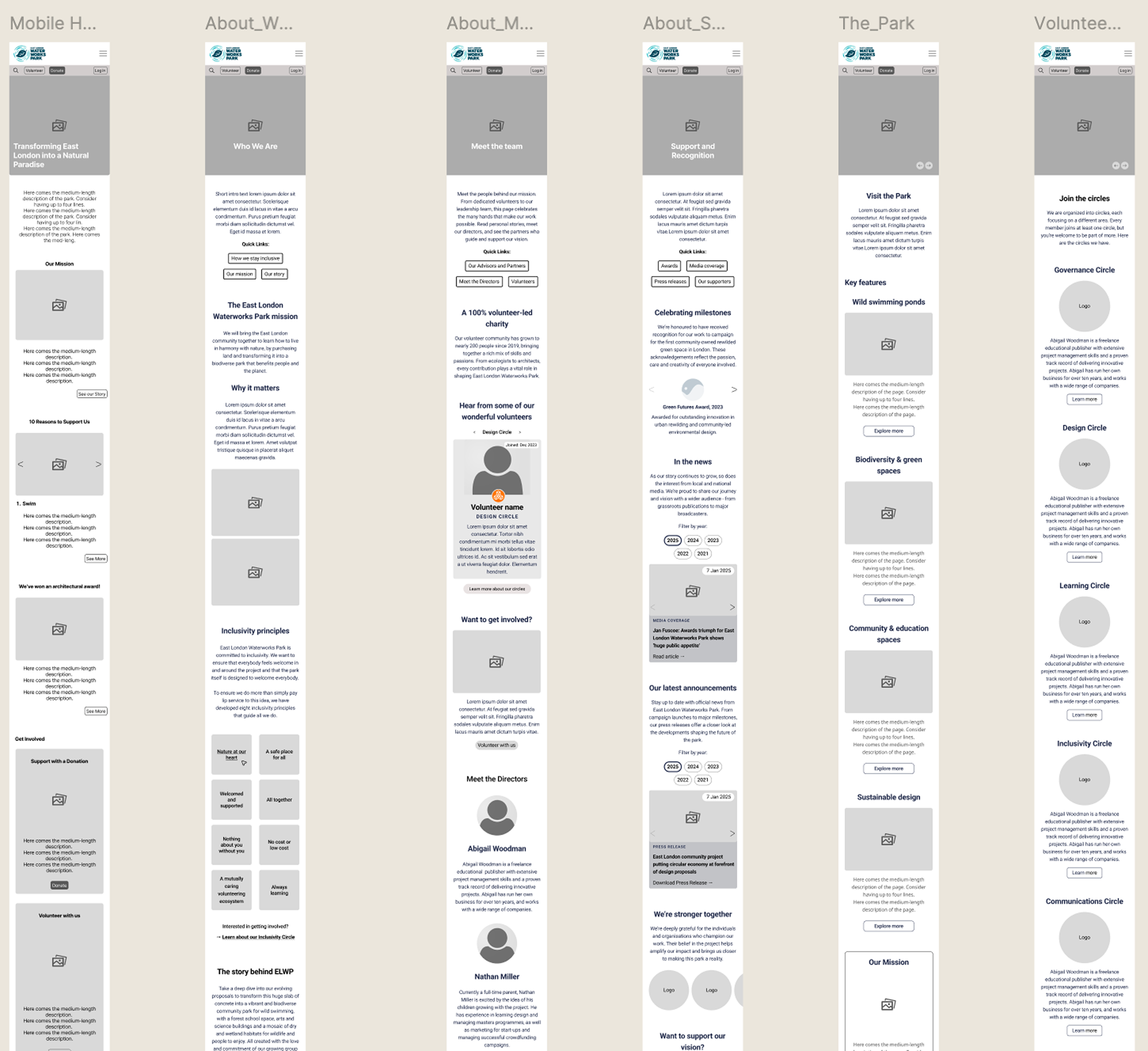
Mobile-First Thinking
Designing for the smallest screens first to ensure the core experience stays punchy and focused.
Reducing Cognitive Overload
Cutting out the visual noise so users don't get "choice paralysis" when trying to help out.
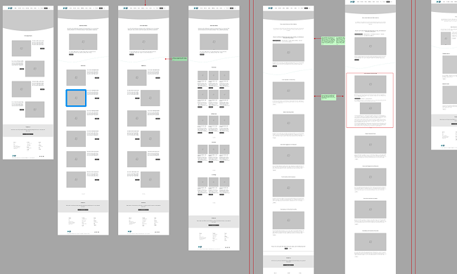
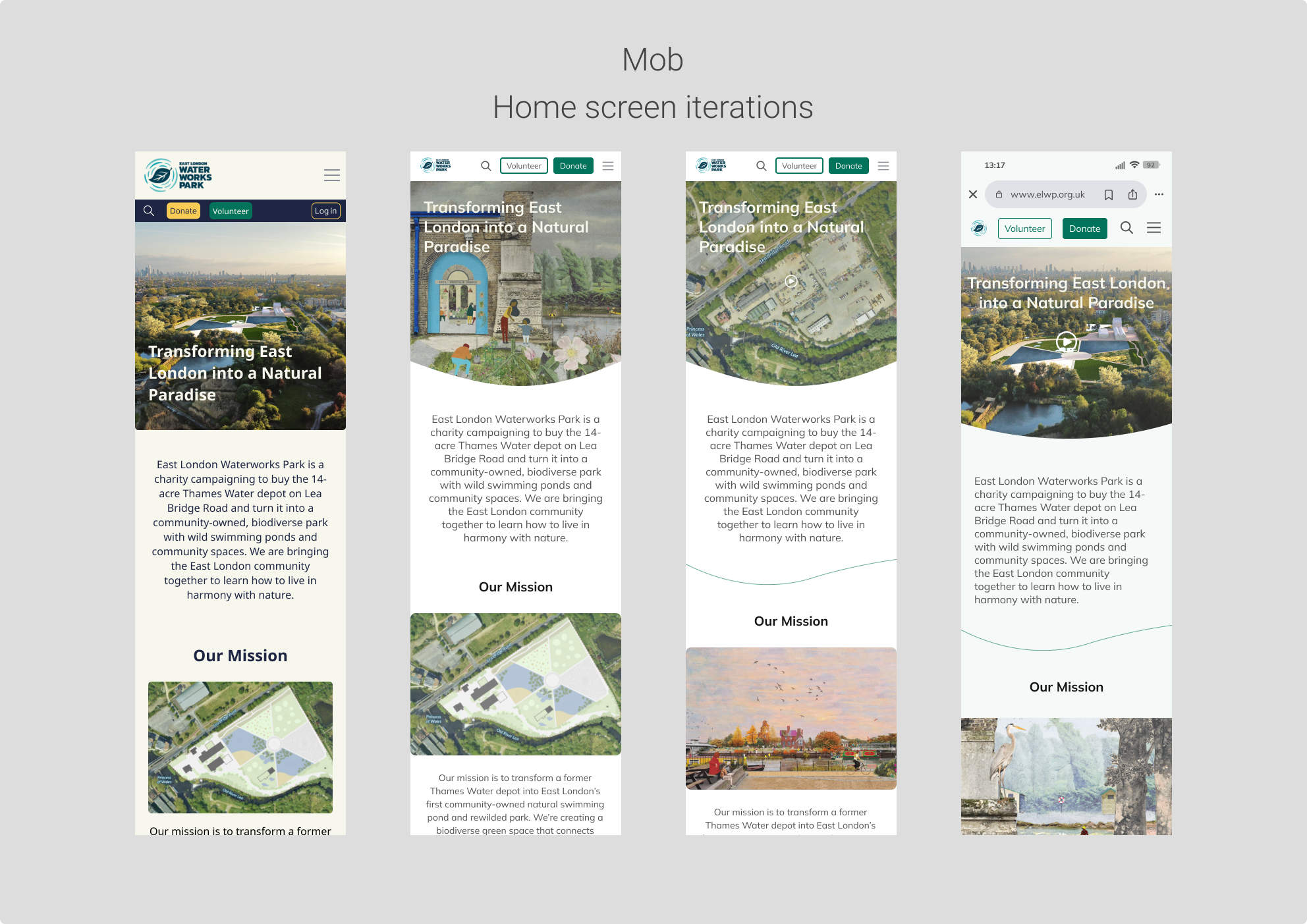
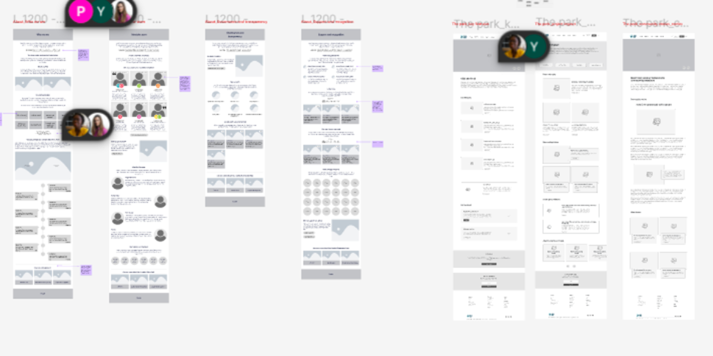
With our map in hand, we started wireframing! Using the collaborative info on Figjam, our competitive audit, benchmarks and shared understanding of stakeholder aims and desires, I helped to lead the charge on wireframing for both desktop and mobile.
With a large focus on mobile adaptation, I aimed to ensure the experience felt consistent whether you were browsing on a laptop or a phone.
We focused on killing the "clutter" and making sure the volunteer journey was as inviting as the ponds themselves.
Converting design to reality
It was then time to bring the vision to life.
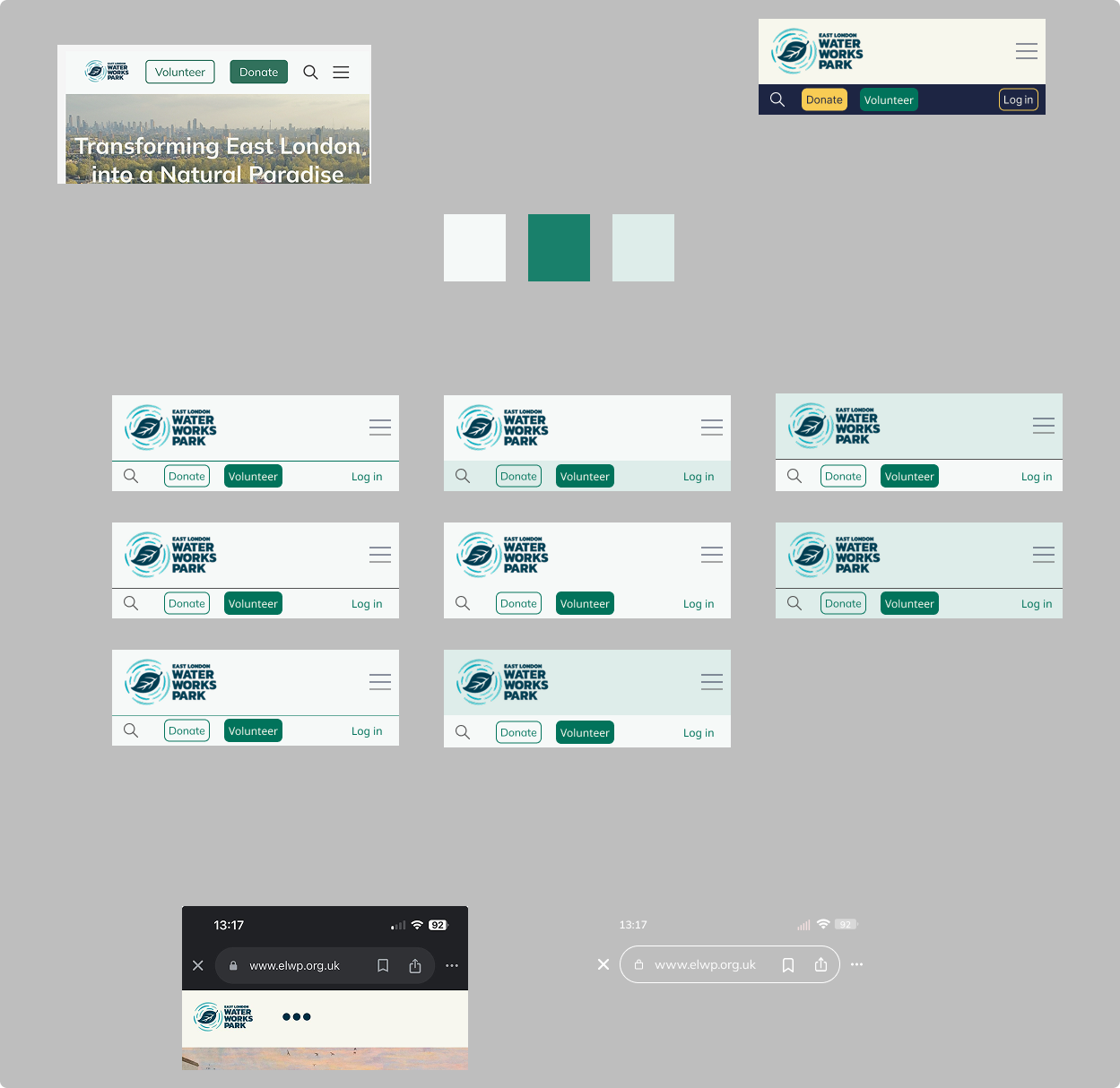
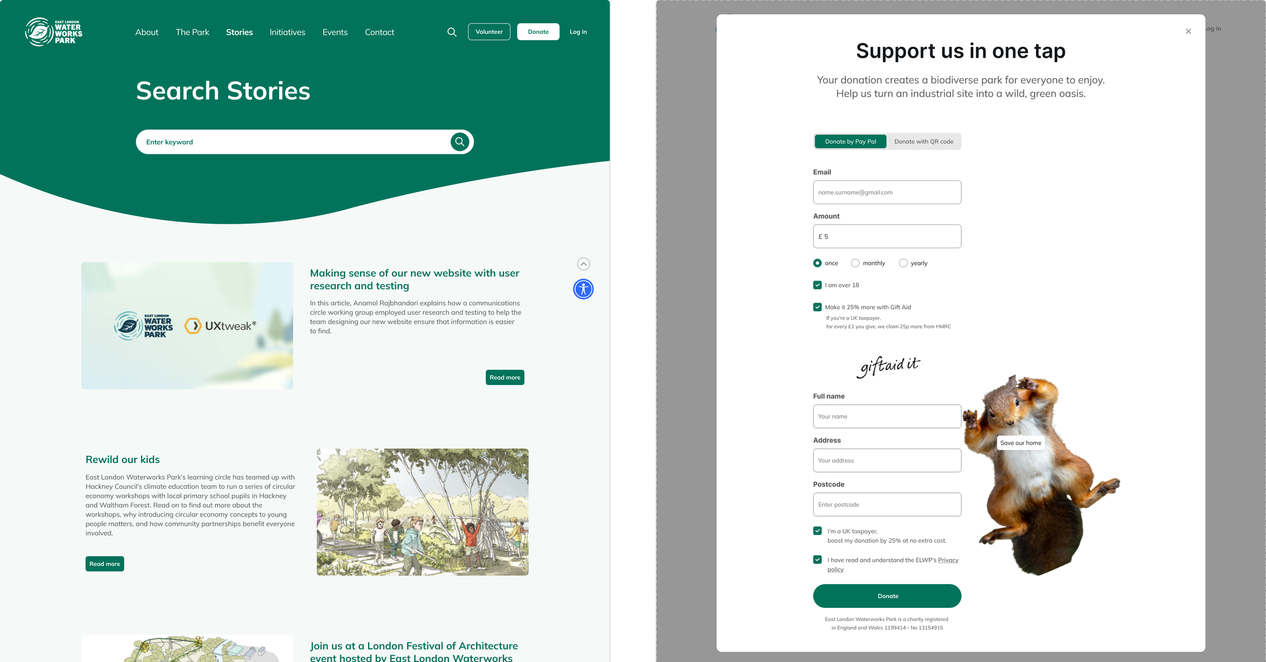
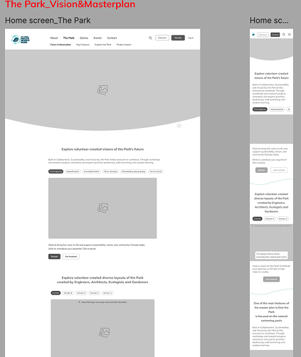
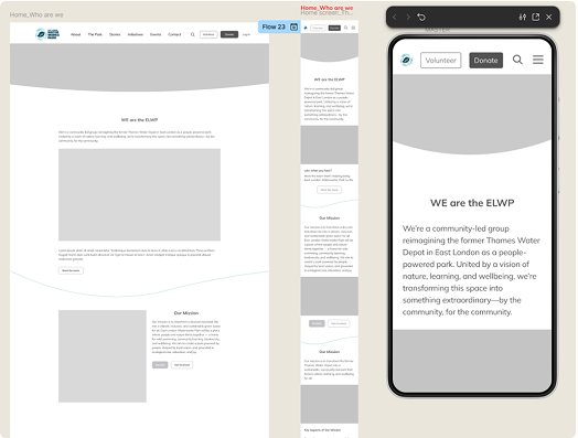
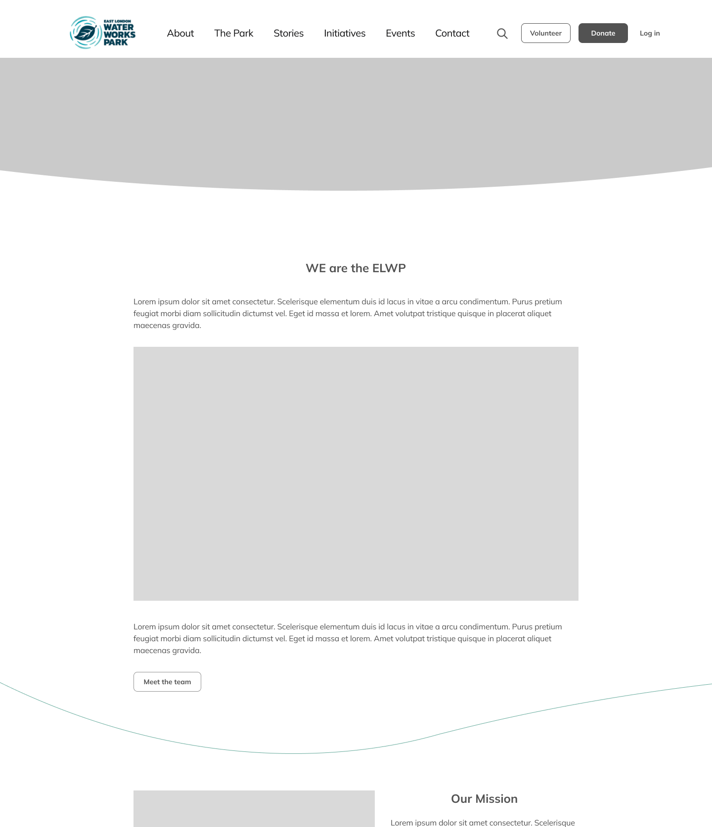
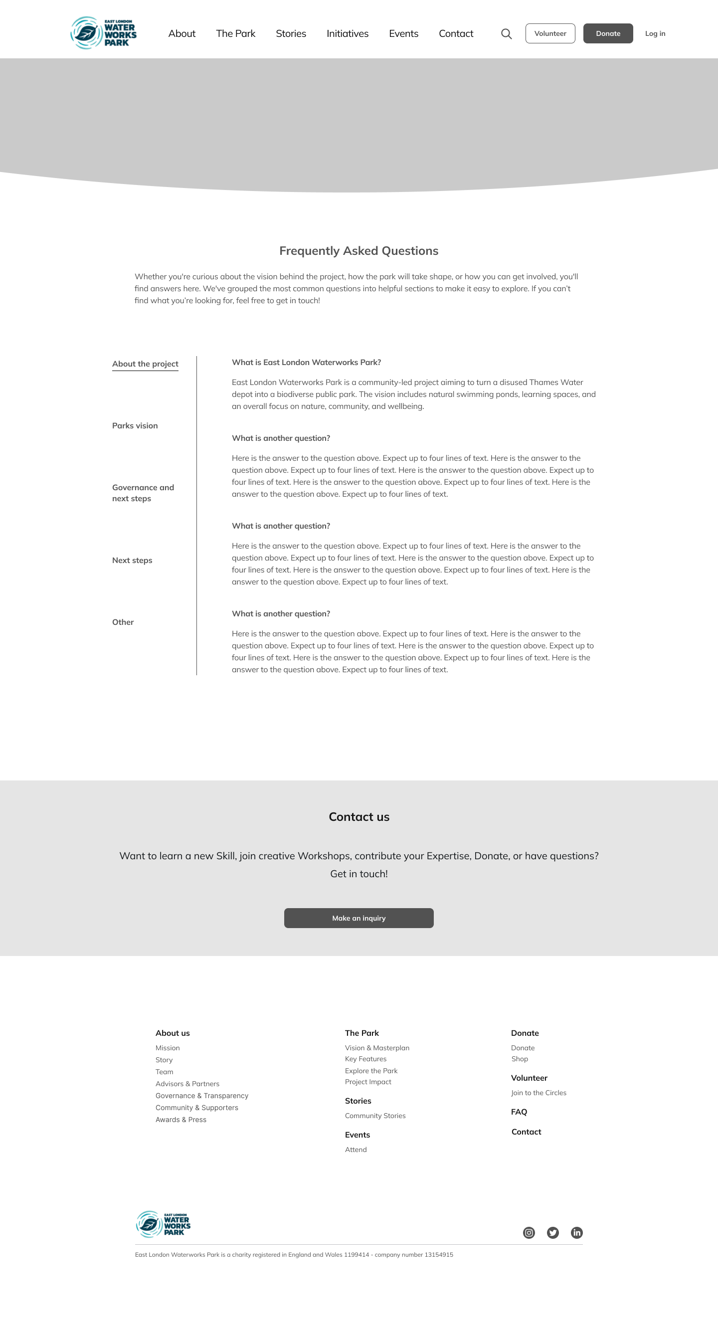
Using our earthy style guide — centred around organic shapes and calm, natural tones — I helped design high-fidelity mockups that felt clean, welcoming, and aligned with the park’s identity.
I also incorporated thoughtful micro-interactions to clearly communicate how the site should feel and respond as users engage with it.
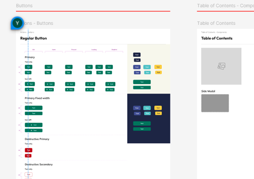
To ensure consistency, we developed a shared design system so every button, icon, and component worked seamlessly together as part of one cohesive experience.
Key principles involved
Aesthetic-Usability Effect – Making the site look beautiful because users actually perceive "pretty" tools as more usable and trustworthy.
Design Consistency – Using a unified component library so users never feel lost in a sea of different styles.